
depictr is a single, consistent toolkit of plots that span the whole
analysis workflow, from a first look at the data, through model
estimates and predictions, to diagnostics, uncertainty and reporting.
Every plotting function returns a ggplot2 object (Wickham, 2016)
(or a patchwork for composite panels), so you can keep
customising with the usual + syntax, and every plot shares
one theme, one palette and one set of label conventions.
Attaching package: 'depictr'The following object is masked _by_ '.GlobalEnv':
simulate_figureFive datasets to explore
The package ships with five reproducibly simulated datasets, each
chosen to exercise a different family of plots. They are documented
under their names (e.g. ?lexical_decision) and load with
data():
-
lexical_decision: a counterbalanced, crossed reaction-time/accuracy experiment (participant, item, condition, modality, word frequency). For mixed models and the classification plots. -
wellbeing_survey: a cross-sectional survey (life satisfaction, stress, sleep, income, age, ordered education, region) with informative missingness. For descriptives, correlations, regression and missing data. -
crop_yield: a field trial with a genuine fertiliser-by-treatment interaction. For regression, scatter-trend and interaction plots. -
clinical_trial: a two-arm trial with separating survival curves and a rare adverse-event outcome. For survival and imbalanced classification. -
monthly_sales: two seasonal monthly series (indoor/outdoor). For the time-series plots.
A tour by task
Begin with the data. explore_bivariate() chooses a
suitable plot for any pair of variables, here a scatter with a trend
because both are numeric.
explore_bivariate(crop_yield, fertiliser, yield)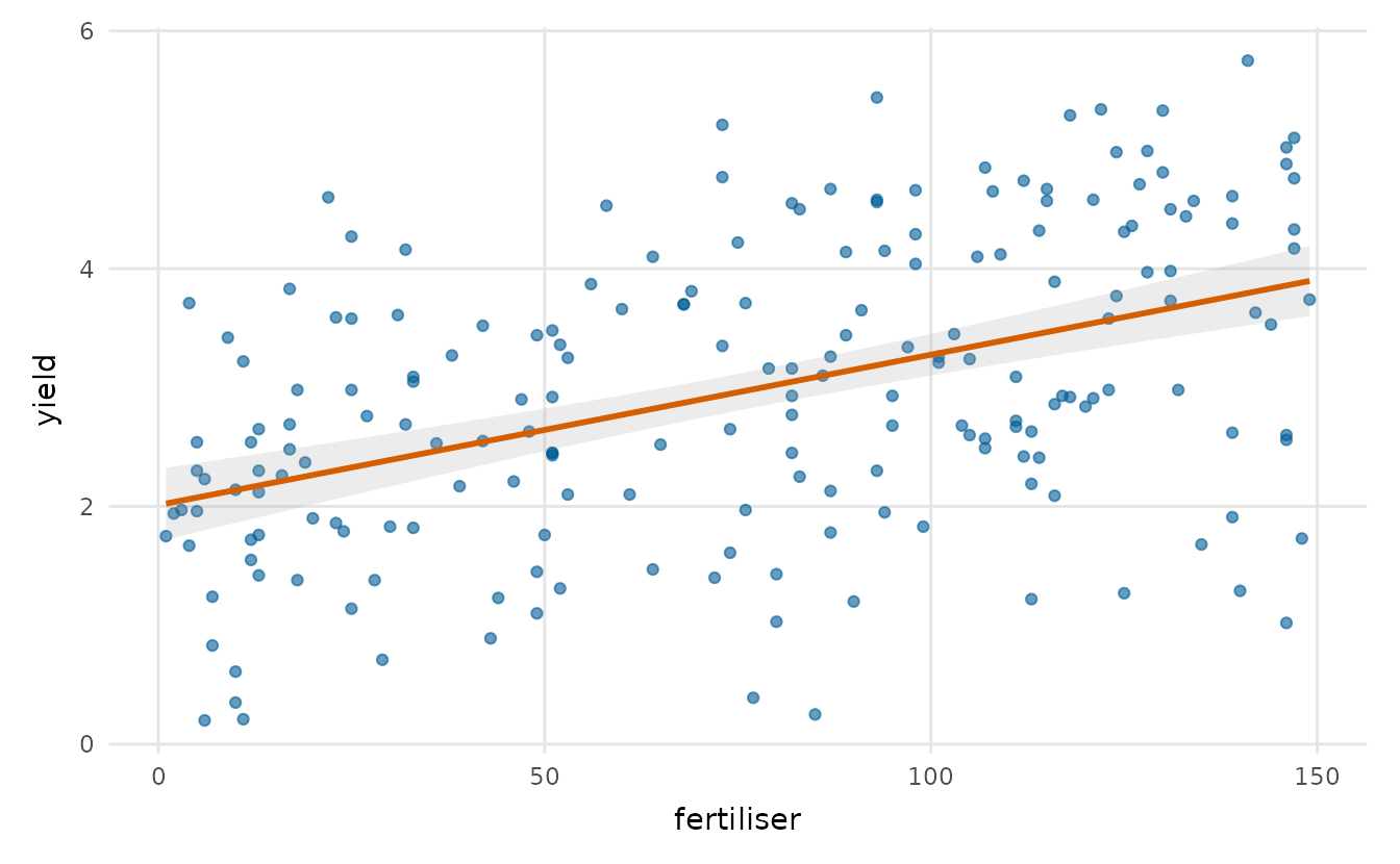
Turn next to the model. After fitting it,
coefficient_plot() draws a forest plot of the
estimates.
fit <- lm(yield ~ rainfall + fertiliser + soil_ph + treatment,
          data = crop_yield)
coefficient_plot(fit, order = "descending", title = "Drivers of crop yield")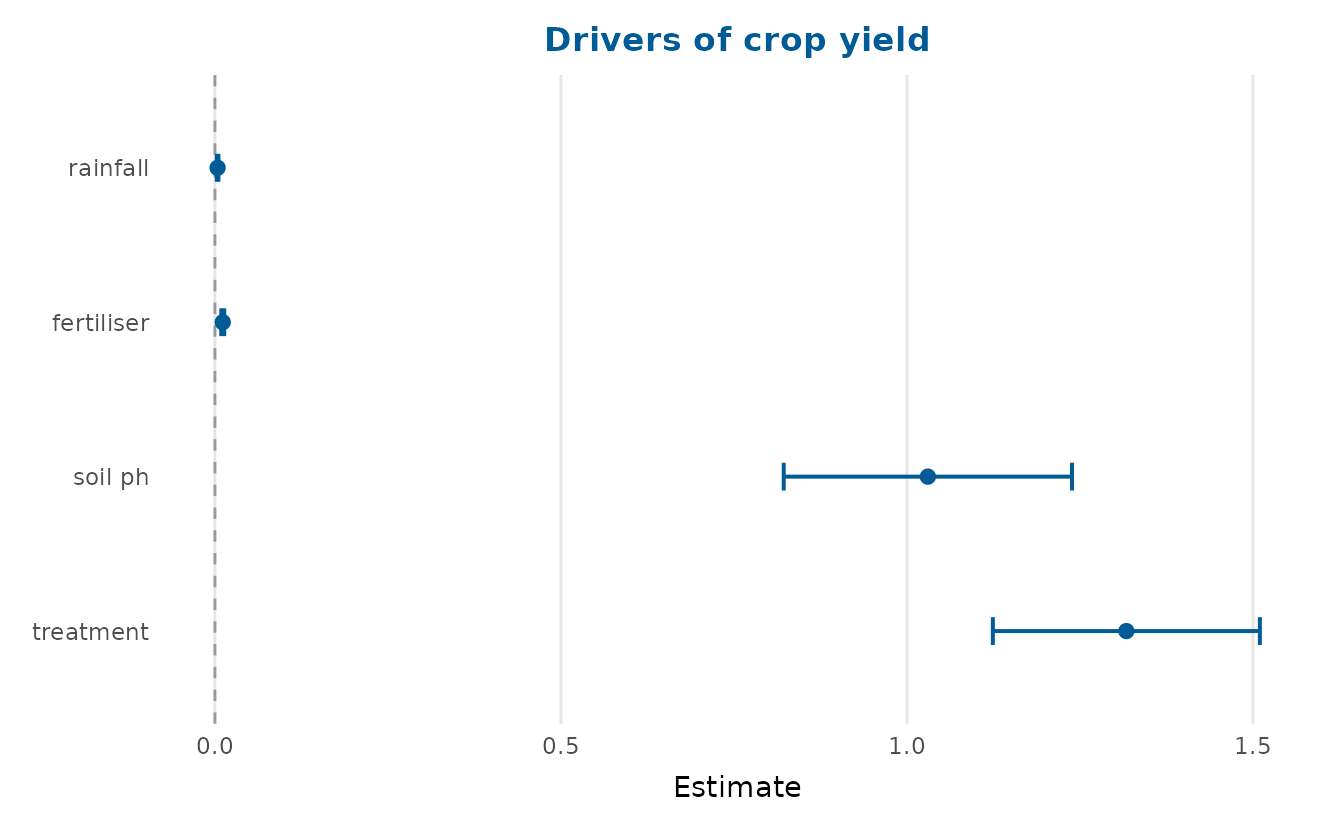
To see what the model implies, effects_plot() traces the
predicted response as one predictor varies.
effects_plot(fit, "fertiliser")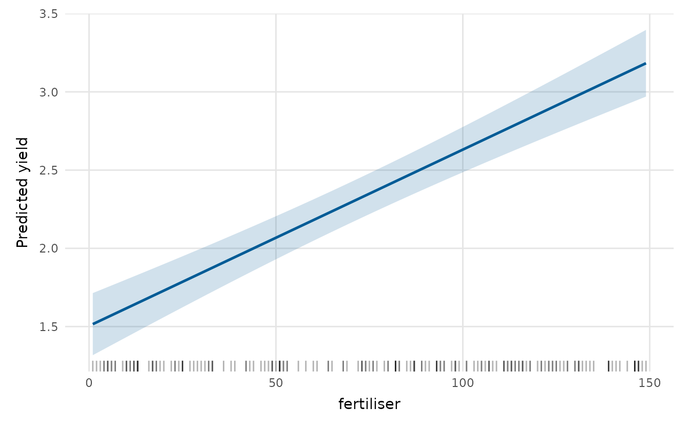
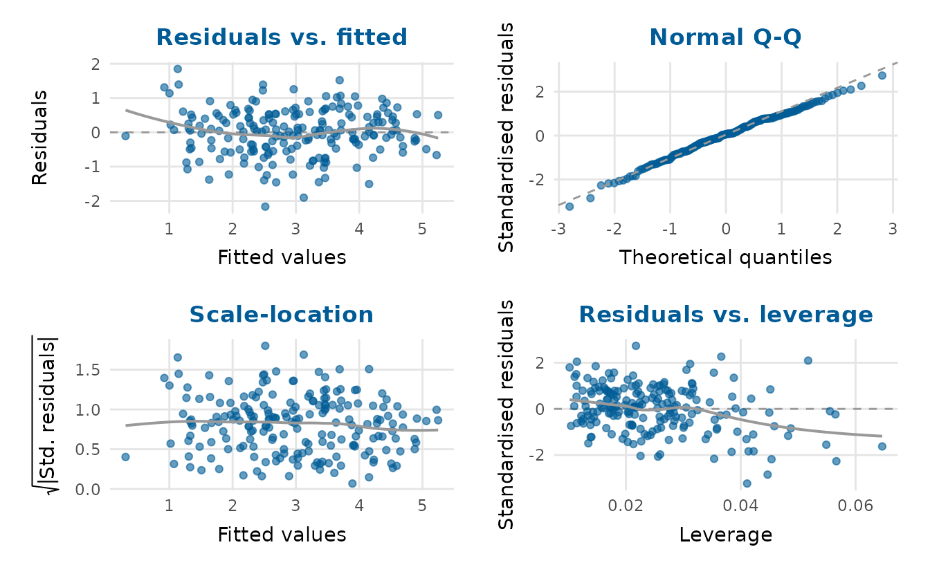
residual_diagnostics_plot() gathers the usual checks of
the fit into one panel.
For uncertainty, posterior_plot() summarises posterior
or simulation draws as a distribution per parameter. These are the
fixed-effect posterior draws from a Bayesian fit of the lexical-decision
model, shipped with the package.
draws <- readRDS(system.file("extdata", "lexdec_draws.rds",
                             package = "depictr"))
posterior_plot(draws[c("conditionunrelated", "modalityauditory",
                       "word_frequency")],
               labels = c(conditionunrelated = "condition",
                          modalityauditory = "modality",
                          word_frequency = "word frequency"),
               title = "Lexical-decision fixed effects (ms)")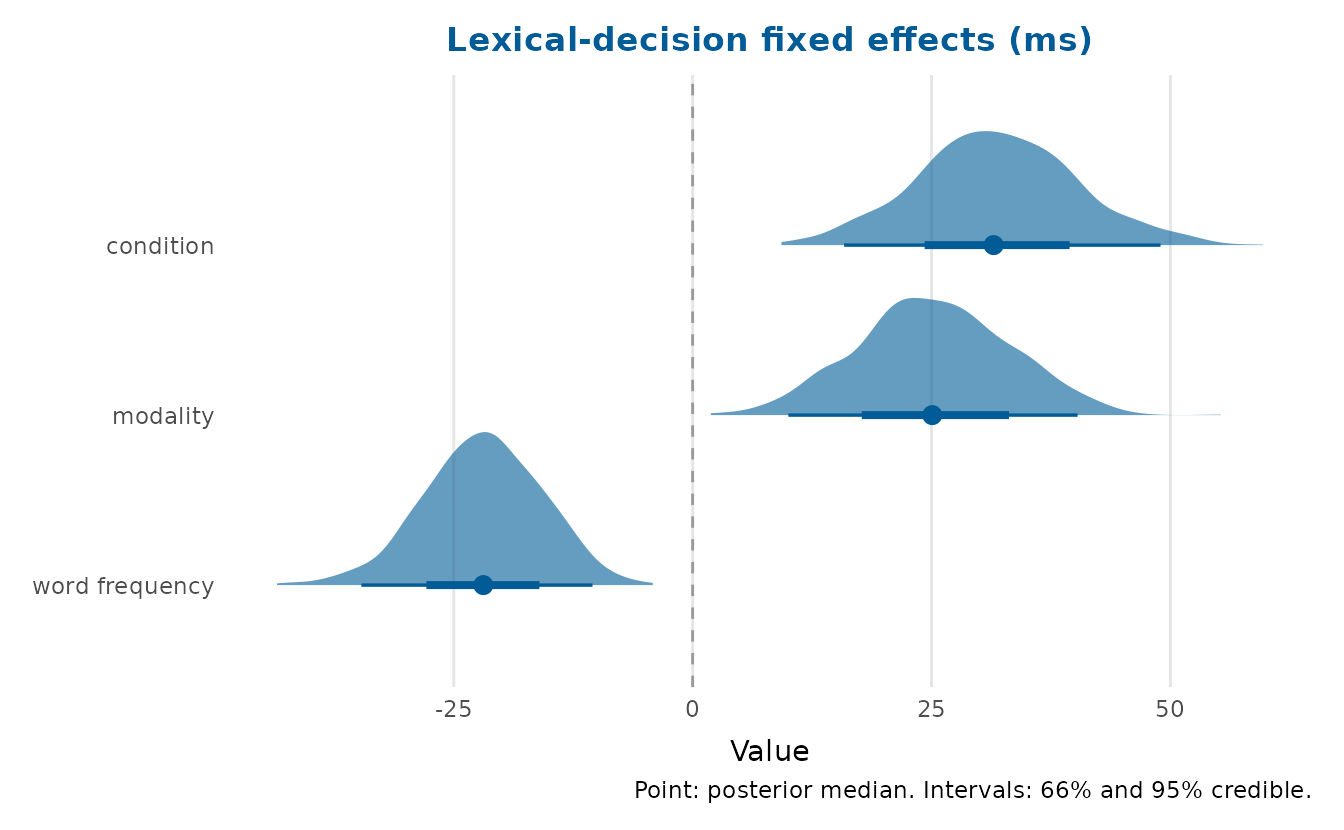
The shared spine: tidy_estimates()
Most of the model functions rest on tidy_estimates(),
which turns a model, or a data frame of pre-computed estimates, into one
standard table. Because the plotting functions also accept that table,
estimates from any source (Bayesian posteriors, bootstrap intervals, or
figures taken from a paper) can be supplied directly.
tidy_estimates(fit) term estimate std.error conf.low conf.high
1 (Intercept) -7.156372471 0.7307020339 -8.597465983 -5.715278960
2 rainfall 0.003869765 0.0006025038 0.002681505 0.005058026
3 fertiliser 0.011266582 0.0010906005 0.009115695 0.013417469
4 soil_ph 1.030217728 0.1056219670 0.821909657 1.238525800
5 treatmentenhanced 1.317044684 0.0978270830 1.124109715 1.509979654A consistent, accessible look
theme_depictr(), depictr_palette() and
scale_colour_depictr() style your own plots too:
library(ggplot2)
ggplot(crop_yield, aes(fertiliser, yield, colour = treatment)) +
  geom_point(alpha = 0.7) +
  scale_colour_depictr() +
  theme_depictr()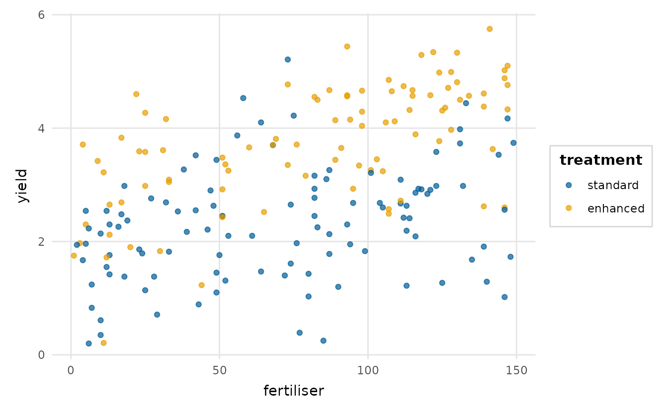
depictr_palette() returns the underlying hex colours
directly, ready to feed scale_fill_manual() or a
base-graphics col = argument:
[1] "#005b96" "#e69f00" "#009e73" "#d55e00"The qualitative palette is based on the Okabe-Ito set (Okabe & Ito, 2008), which stays distinguishable under the common forms of colour-vision deficiency, and sequential and diverging variants are available too. Preview them with:
palette_preview(type = "all")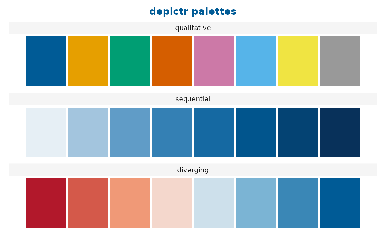
palette_preview() can also simulate a
colour-vision deficiency, so you can check a palette as a deuteranope
(red-green) would see it:
palette_preview(cvd = "deutan")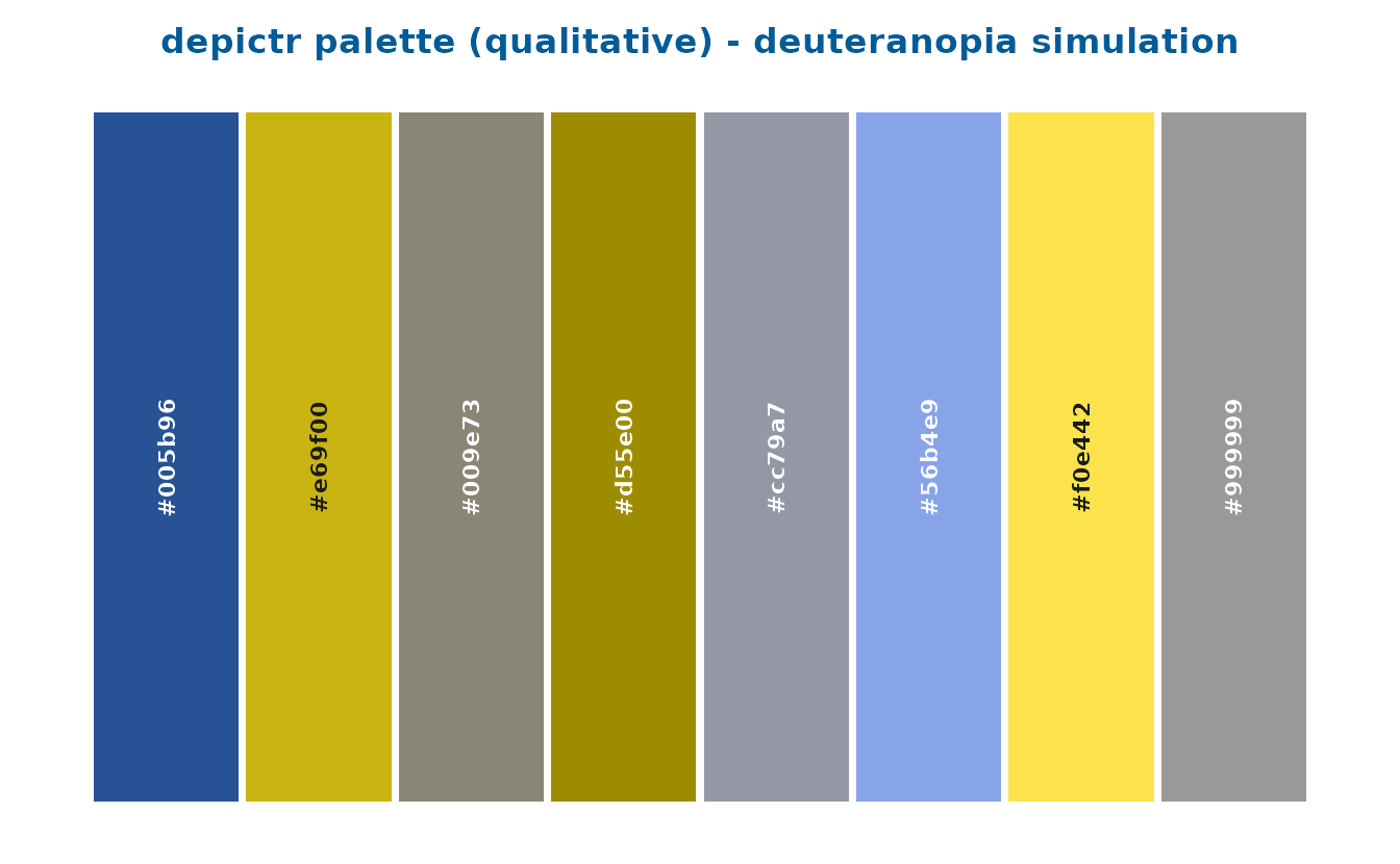
The simulation is available on its own as
simulate_cvd(), and palette_safety() turns it
into a verdict: for normal vision and each deficiency at full severity
it reports the smallest perceptual distance between any two colours in a
palette, the CIEDE2000 colour difference (Sharma et al., 2005), so the
accessibility claim comes with a number attached.
$min_delta_e
[1] 6.43

$by_condition
normal protan deutan tritan
 21.25  13.44   6.43  11.13

$worst_condition
[1] "deutan"

$worst_pair
[1] "#cc79a7" "#999999"

$safe
[1] TRUE

$threshold
[1] 5
simulate_figure() applies the same simulation to a whole
figure. Every colour the figure draws goes through it, in the legend
keys, the text and any colourbar as well as in the data. The result is a
gtable that grid::grid.draw() draws and
save_plot() saves. Here is the scatter plot from the start
of this section as a reader with deuteranopia sees it:
by_treatment <- ggplot(crop_yield, aes(fertiliser, yield, colour = treatment)) +
  geom_point(alpha = 0.7) +
  scale_colour_depictr() +
  theme_depictr()

grid::grid.newpage()
grid::grid.draw(simulate_figure(by_treatment, "deutan"))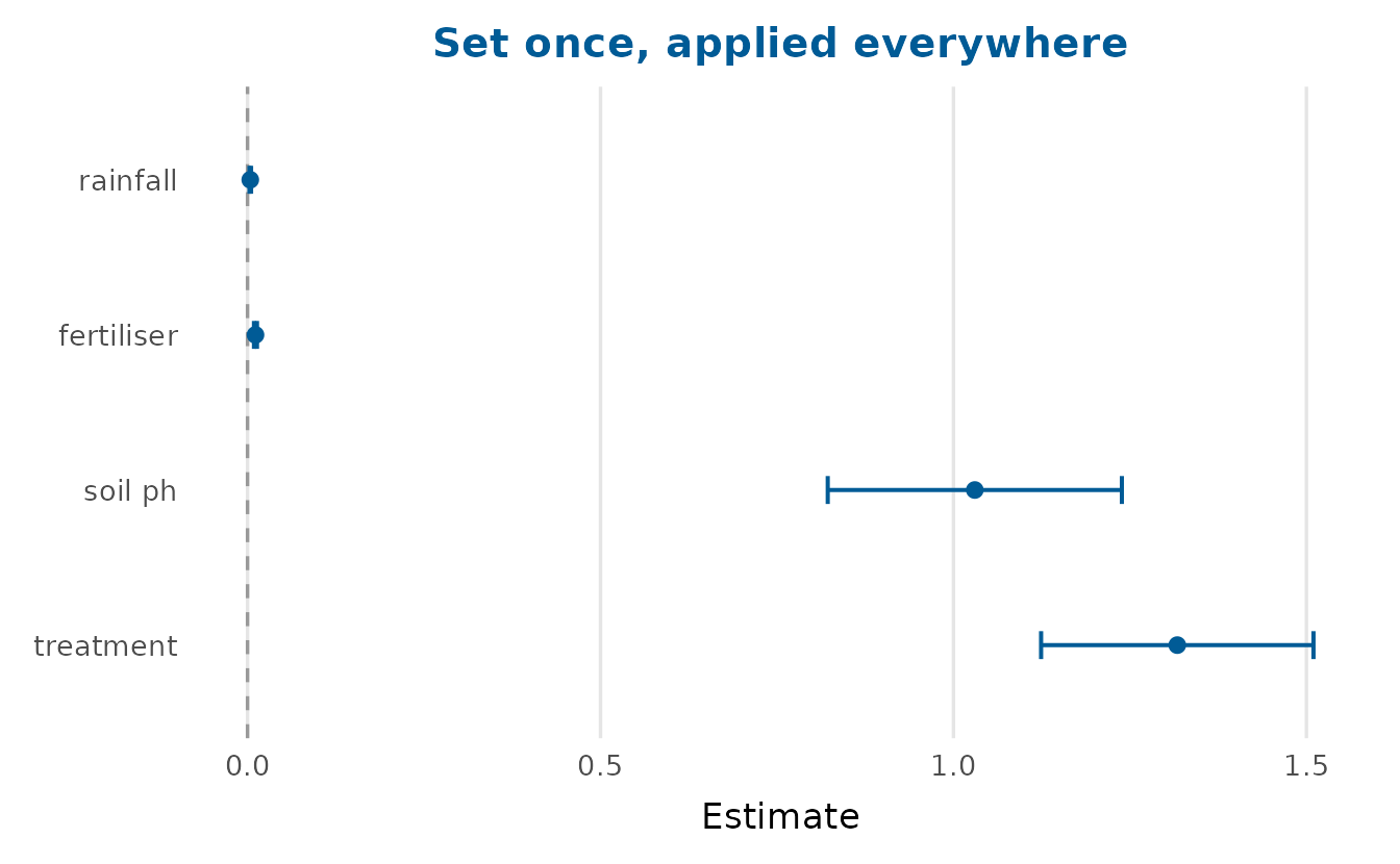
Auditing the figure you are about to submit
A safe palette is not a safe figure. Once a plot has been extended
with your own scale, shrunk to fit a journal column, or asked to
distinguish groups by colour alone, the palette’s guarantee no longer
describes what a reader will see. check_figure() reads a
built plot and reports what it measured, next to the threshold it was
measured against, so each verdict can be argued with.
grouped <- ggplot(crop_yield, aes(fertiliser, yield, colour = treatment)) +
  geom_point(alpha = 0.7) +
  scale_colour_depictr() +
  theme_depictr()

check_figure(grouped)
check measured threshold verdict
1 colour_separability 52.37 5.0 pass
2 colour_separability_protan 48.53 5.0 pass
3 colour_separability_deutan 53.10 5.0 pass
4 colour_separability_tritan 49.09 5.0 pass
5 greyscale_separability 23.06 5.0 pass
6 text_size 8.80 6.0 pass
7 text_contrast 8.45 4.5 pass
8 geometry_contrast 1.76 3.0 fail
9 redundant_encoding 0.00 1.0 fail
10 annotation_text_size NA 6.0 not applicable
detail
1 Closest pair #4d8cb6 and #eebc4d of 2 encoding colours.
2 Closest pair #4d8cb6 and #eebc4d of 2 encoding colours.
3 Closest pair #4d8cb6 and #eebc4d of 2 encoding colours.
4 Closest pair #4d8cb6 and #eebc4d of 2 encoding colours.
5 Closest pair #4d8cb6 and #eebc4d in CIE lightness.
6 Smallest text 8.80 pt, drawn at 17.78 cm and printed at 17.78 cm.
7 Lowest-contrast text #4d4d4d on #ffffff at 8.80 pt.
8 Lowest-contrast colour #e69f00 at alpha 0.70, drawn as #eebc4d, on #ffffff.
9 Colour alone distinguishes the groups.
10 The figure draws no text inside the panel.Two rows are worth dwelling on. geometry_contrast
measures each encoding colour, as it is drawn, against the panel
background. The palette’s orange falls below the 3:1 that WCAG asks of a
graphical object (World
Wide Web Consortium, 2023) even when opaque, at 2.25:1, and
further when drawn translucent, as these points are.
redundant_encoding is zero because nothing but colour tells
the two treatments apart. Mapping shape as well, letting the darker
vermillion do the second colour’s work and drawing the points opaque
clears both:
mended <- ggplot(crop_yield, aes(fertiliser, yield, colour = treatment,
                                 shape = treatment)) +
  geom_point() +
  scale_colour_manual(values = c("#005b96", "#d55e00")) +
  theme_depictr()

check_figure(mended)[, c("check", "measured", "threshold", "verdict")]
check measured threshold verdict
1 colour_separability 50.12 5.0 pass
2 colour_separability_protan 49.67 5.0 pass
3 colour_separability_deutan 58.30 5.0 pass
4 colour_separability_tritan 61.99 5.0 pass
5 greyscale_separability 16.92 5.0 pass
6 text_size 8.80 6.0 pass
7 text_contrast 8.45 4.5 pass
8 geometry_contrast 3.87 3.0 pass
9 redundant_encoding 1.00 1.0 pass
10 annotation_text_size NA 6.0 not applicableThe vermillion need not be typed by hand.
scale_colour_depictr(order = "contrast") draws the groups
in the contrast-first order of depictr_palette(). It leads
with the brand blue, the vermillion and the reddish purple, the only
three of the eight colours that clear every colour row together. The
bluish green comes fourth, and with it four groups still keep 3:1
against white.
depictr_options(palette = depictr_palette(order = "contrast"))
makes that order the default for every later plot. Under it, the second
group takes the vermillion, which depictr also uses as its accent for
single highlights.
The audit also takes a stated output width, which is where most figure text quietly fails. Text is drawn in points, so a figure saved seven inches wide and then printed in an 8.9 cm column arrives at half the size it looked on screen:
subset(check_figure(grouped, width_cm = 8.9), check == "text_size") check measured threshold verdict
6 text_size 4.4 6 fail
detail
6 Smallest text 8.80 pt, drawn at 17.78 cm and printed at 8.90 cm.A figure saved at the size it will be printed is drawn at that size,
so give the saved width as both width_cm and
render_width_cm, or leave both at their defaults. Text
drawn inside the panel, such as an annotation, a label or a cell value,
has a row of its own, annotation_text_size, held to the
same floor. That floor defaults to 6 pt, which is lenient. As their
guidelines stood on 30 September 2026, PLOS and APA Style asked for at
least 8 pt, Elsevier for 7 pt and Nature for 5 to 7 pt, and
?check_figure links all four.
Nature’s range has a ceiling as well as a floor, since no text but
the panel labels may exceed 7 pt. Passing max_text_pt = 7
holds a figure to it in a row of its own, text_size_max.
save_plot(check = TRUE) runs the audit as it saves, at the
width it saves at, and warns about each check the figure fails.
One limitation belongs here, beside the claim it qualifies, since the package is the one making that claim. The eight-colour qualitative palette clears every colour-vision check and fails the greyscale check: its orange and its sky blue differ by 0.79 in CIE lightness, so a black-and-white printer renders them as the same grey. The Okabe-Ito guarantee is about hue confusion and was never a claim about greyscale. The threshold stays where it is, the check reports the number, and the claim has been narrowed to match. A figure that may be printed in black and white wants fewer groups, a sequential palette, or a redundant shape or line type.
eight <- data.frame(g = factor(letters[1:8]), x = 1:8, y = 1:8)
p8 <- ggplot(eight, aes(x, y, colour = g)) +
  geom_point() +
  scale_colour_depictr() +
  theme_depictr()

subset(check_figure(p8), check == "greyscale_separability")
check measured threshold verdict
5 greyscale_separability 0.79 5 fail
detail
5 Closest pair #56b4e9 and #e69f00 in CIE lightness.The audit does not measure a continuous colour or fill scale, such as that of a heatmap: its colour rows abstain and say why. A ramp is read by its lightness, so prefer one whose lightness runs evenly from end to end, such as viridis or depictr’s sequential and diverging ramps, over a rainbow (Crameri et al., 2020).
Set the look once for a whole script with
depictr_options(). It carries the base size and family, the
brand and accent colours and a custom palette, so the same arguments
need not travel with every call. Called with no arguments it reports the
current settings:
$base_size
[1] 11

$base_family
[1] ""

$brand
[1] "#005b96"

$accent
[1] "#d55e00"

$reference
[1] "grey60"

$palette
NULL

$na_value
[1] "grey80"
Supplying arguments sets them for every later plot and returns the previous values, so you can put the look back afterwards:
old <- depictr_options(base_size = 13, accent = "#b3589a")
coefficient_plot(fit, title = "Set once, applied everywhere")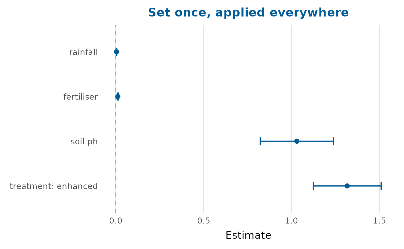
do.call(depictr_options, old) # restore the previous settingsWhere to next
The remaining articles go into each area in turn.
vignette("exploring-data") covers distributions,
categories, bivariate plots, scatter-plot matrices, correlations,
missingness, outliers, summary tables and the estimation plots.
vignette("model-estimates") is the flagship: forest plots,
model comparison, predicted values, interactions, random effects,
optimiser checks and the frequentist-over-Bayesian-posterior overlay.
vignette("diagnostics-and-uncertainty") covers residuals,
GLM-appropriate binned residuals, the classification suite (ROC, PR,
gains, lift, calibration, thresholds) on an imbalanced outcome, and
power curves. Two further articles,
vignette("multivariate-and-survival") and
vignette("time-series"), cover the remaining methods.