
depictr provides a small, consistent set of time-series plots. The
examples use the bundled monthly_sales dataset: two product
lines (indoor and outdoor), each with six
years of monthly observations carrying a trend, a twelve-month seasonal
cycle and noise.
Plotting one or several series
timeseries_plot() accepts a ts object, a
numeric vector or a data frame with time, value and (optionally) group
columns. Passing the long-form data frame with a grouping column draws
both series at once, each in its own colour, and a moving-average
overlay is one argument away.
timeseries_plot(monthly_sales, time = date, value = sales, group = series,
                rolling = 12, title = "Monthly sales by product line",
                y_lab = "Units")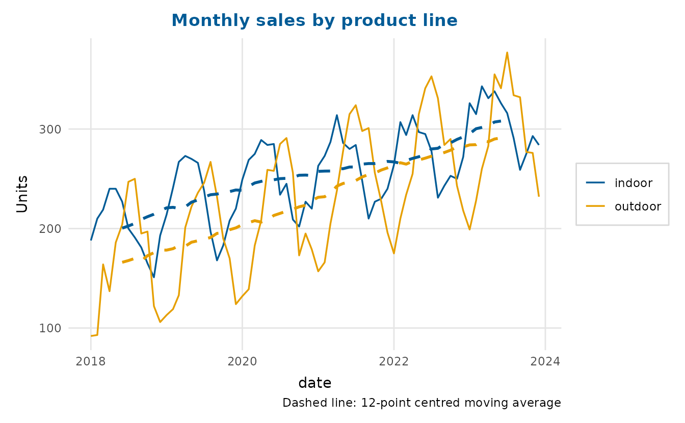
Twelve months is an even window, so the overlay is the 2×12 moving average that the caption names (Hyndman & Athanasopoulos, 2021, Section 3.3). It is a twelve-month average followed by a two-month one, which centres it on each month.
For the single-series views (decomposition, autocorrelation, the
seasonal plot and forecasting) we extract one line as a monthly
ts object of frequency 12.
Decomposition
decompose_plot() separates a seasonal series into trend,
seasonal and remainder components. Use method = "stl" (the
default, loess-based) or method = "classical". Setting
confidence = TRUE shades a band around the smoothed trend,
from the spread of the remainder, so the scale of the unexplained
variation is visible rather than implied by the line alone.
decompose_plot(indoor_ts, confidence = TRUE, title = "Indoor sales, decomposed")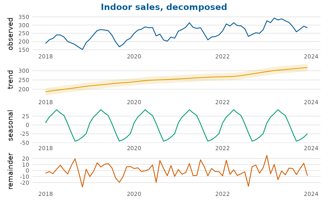
Classical decomposition holds the seasonal component fixed across the
whole series, and so does STL (Cleveland et al., 1990) with its
default s_window = "periodic".
decompose_plot(indoor_ts, method = "classical",
               title = "Indoor sales, classical decomposition")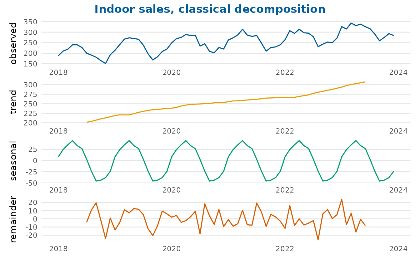
A numeric s_window lets the STL seasonal component
change from year to year. It is the number of consecutive years used to
estimate each seasonal value, an odd number of at least 7, so a smaller
window lets the pattern change faster. The bundled series has a fixed
seasonal pattern by construction, so the effect shows better on
AirPassengers, whose seasonal swing grows with the number
of passengers.
decompose_plot(AirPassengers, s_window = 13,
               title = "Air passengers, with a 13-year seasonal window")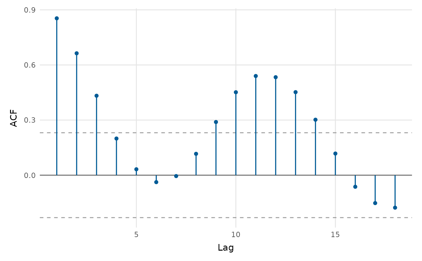
Autocorrelation
acf_plot() draws the autocorrelation (or, with
type = "partial", the partial autocorrelation) function,
with approximate significance bounds. The spikes at multiples of twelve
are the annual seasonality.
acf_plot(indoor_ts)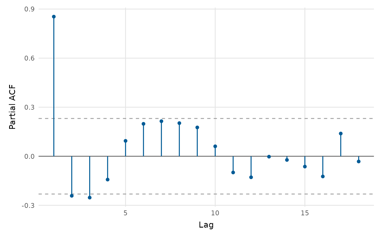
acf_plot(indoor_ts, type = "partial")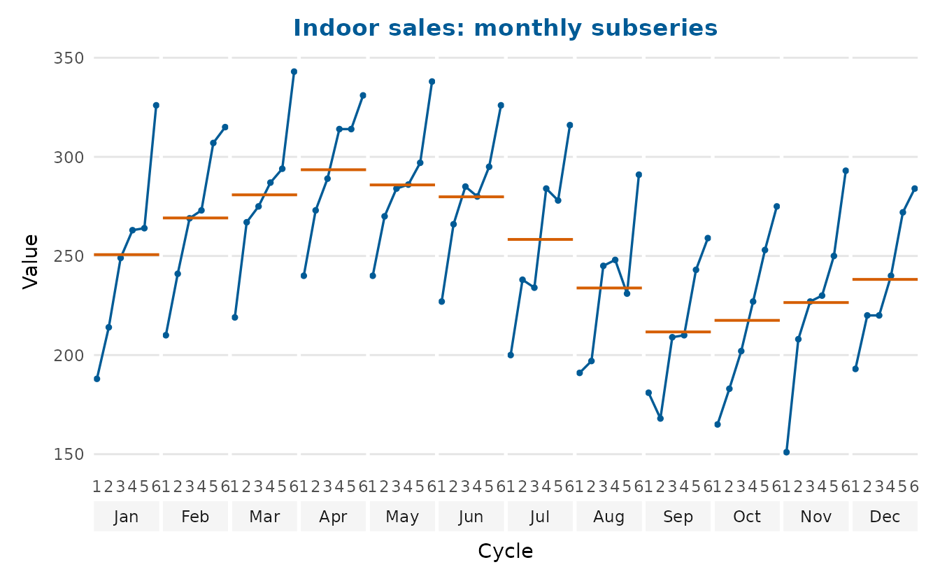
The seasonal pattern up close
seasonal_plot() draws a seasonal-subseries (cycle) plot:
one small panel per month, with the value traced across successive years
and a reference line at each month’s mean. This shows the seasonal shape
(differences between panels) and the year-on-year trend within
each month (the slope inside each panel) at the same time,
something a single overlaid line cannot do.
seasonal_plot(indoor_ts, title = "Indoor sales: monthly subseries")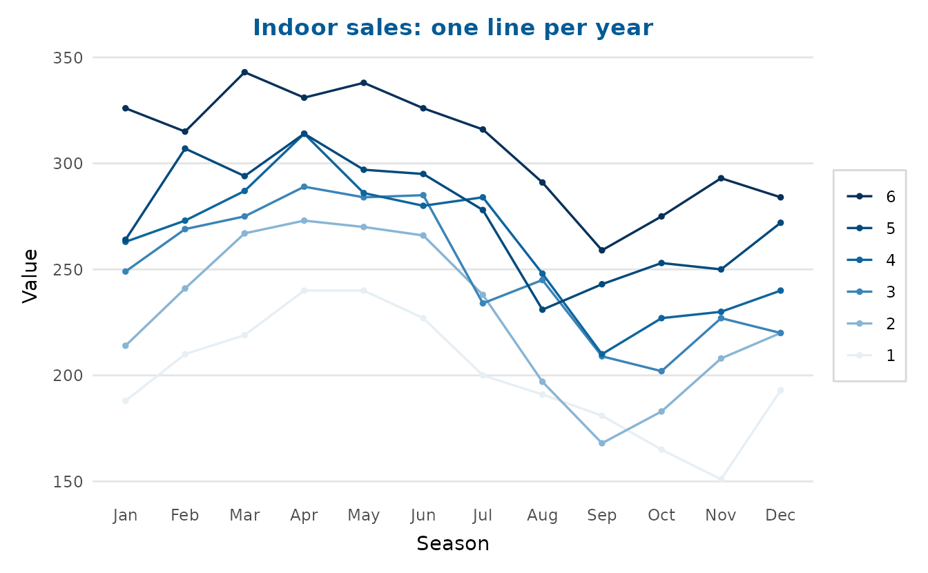
With style = "season" every year becomes its own line
over the months on a shared axis, which is handy for spotting an unusual
year.
seasonal_plot(indoor_ts, style = "season",
              title = "Indoor sales: one line per year")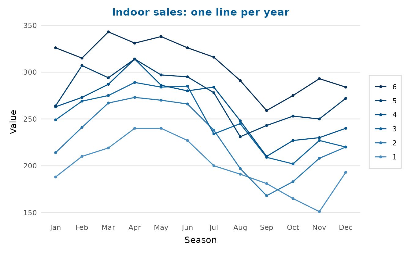
Forecasting
ts_forecast() forecasts by decomposition (Hyndman &
Athanasopoulos, 2021, Section 5.7). It removes the seasonal
component that STL estimates, forecasts what remains with a random walk
with drift and adds the last year’s seasonal pattern back. Its
prediction intervals are those of the random walk with drift, which
widen with the horizon (Hyndman & Athanasopoulos, 2021, Section
5.5).
fc <- ts_forecast(indoor_ts, h = 18, level = 0.9)
head(fc)
time fit lwr upr
1 2024.000 316.3669 291.6190 341.1148
2 2024.083 334.7537 299.5126 369.9948
3 2024.167 346.3072 302.8512 389.7631
4 2024.250 359.1704 308.6539 409.6869
5 2024.333 351.7003 294.8458 408.5547
6 2024.417 346.0037 283.3144 408.6930Passing an integer horizon straight to timeseries_plot()
overlays that forecast on the history: the point forecast continues the
line and the shaded ribbon shows the (growing) 90% prediction interval,
named in the caption.
timeseries_plot(indoor_ts, forecast = 18, level = 0.9,
                title = "Indoor sales with an 18-month forecast",
                y_lab = "Units")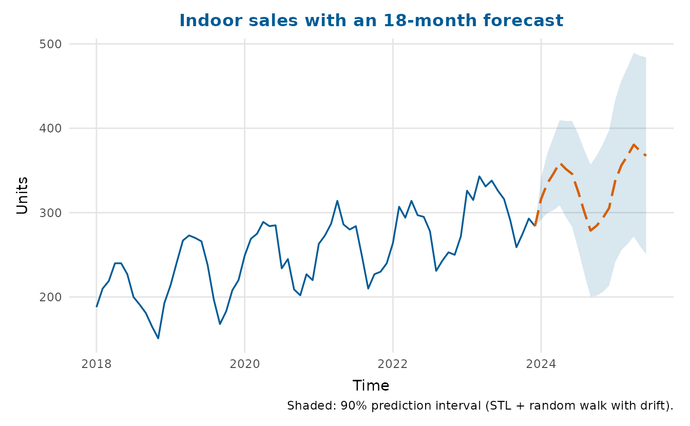
The model assumes a seasonal pattern that adds to the level and stays
the same from year to year. Its band treats that pattern as known, which
leaves out the uncertainty in estimating it. In a rolling-origin
backtest on five classic series whose seasonal swing does not grow with
their level, the nominal 95% band covered 92% of one-step-ahead
outcomes. From three to 12 steps ahead, it covered 99%. The band
therefore runs somewhat narrow at the shortest horizons and wide further
out, where the uncertainty of a random walk keeps growing while these
series stay close to their trend. When the swing does grow with the
level, as it does for AirPassengers, set
lambda = 0 to forecast the logarithm. The forecast comes
back on the original scale, where the point forecast is the median of
the forecast distribution (Hyndman & Athanasopoulos, 2021, Section
5.6).
timeseries_plot(AirPassengers, forecast = 24, level = 0.9, lambda = 0,
                title = "Air passengers with a 24-month forecast",
                y_lab = "Passengers")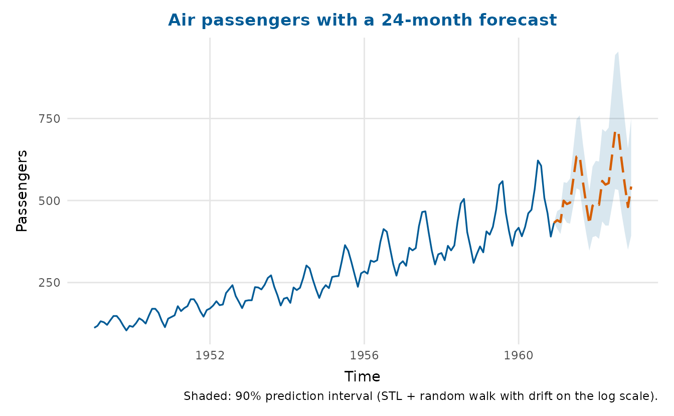
For a different model, fit it yourself (for example with
forecast::forecast()) and pass the resulting
time/fit/lwr/upr
columns to timeseries_plot(forecast = ) as a data
frame.