
Multivariate analysis and survival
Source:vignettes/multivariate-and-survival.Rmd
multivariate-and-survival.RmdBeyond regression, depictr covers three staples of applied data analysis: principal component analysis, clustering (with quality diagnostics) and survival curves.
Principal component analysis
pca_plot() runs a PCA on the numeric columns of a data
frame and draws a biplot: the observations projected onto two
components, with the variable loadings as arrows.
scree_plot() shows how much variance each component
explains.
num <- c("rainfall", "fertiliser", "soil_ph", "yield")
pca_plot(crop_yield, cols = num, group = "treatment",
         title = "Crop-yield PCA")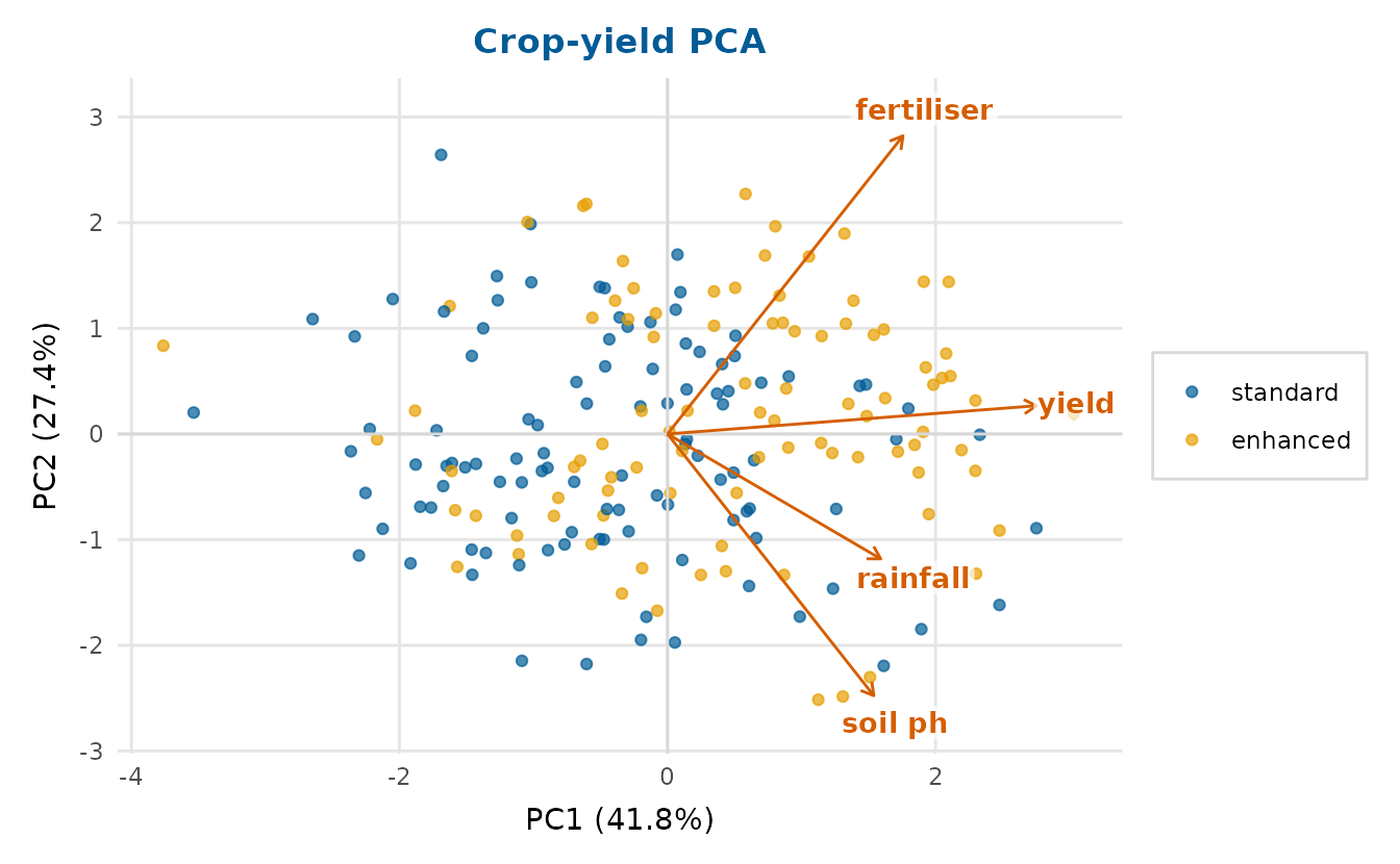
scree_plot(crop_yield, cols = num)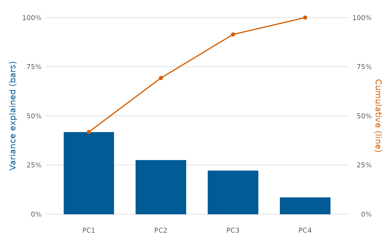
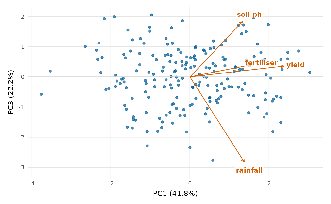
Both functions also accept a ready-made prcomp() object,
so you can analyse once and plot several views:
Clustering
cluster_plot() runs k-means and shows the clusters on
the first two principal components (so it works for any number of
variables), with convex hulls and labelled centroids.
dendrogram_plot() draws a hierarchical-clustering tree and
can cut it into k groups.
cluster_plot(crop_yield, cols = num, k = 3, seed = 1,
             title = "Crop-yield clusters")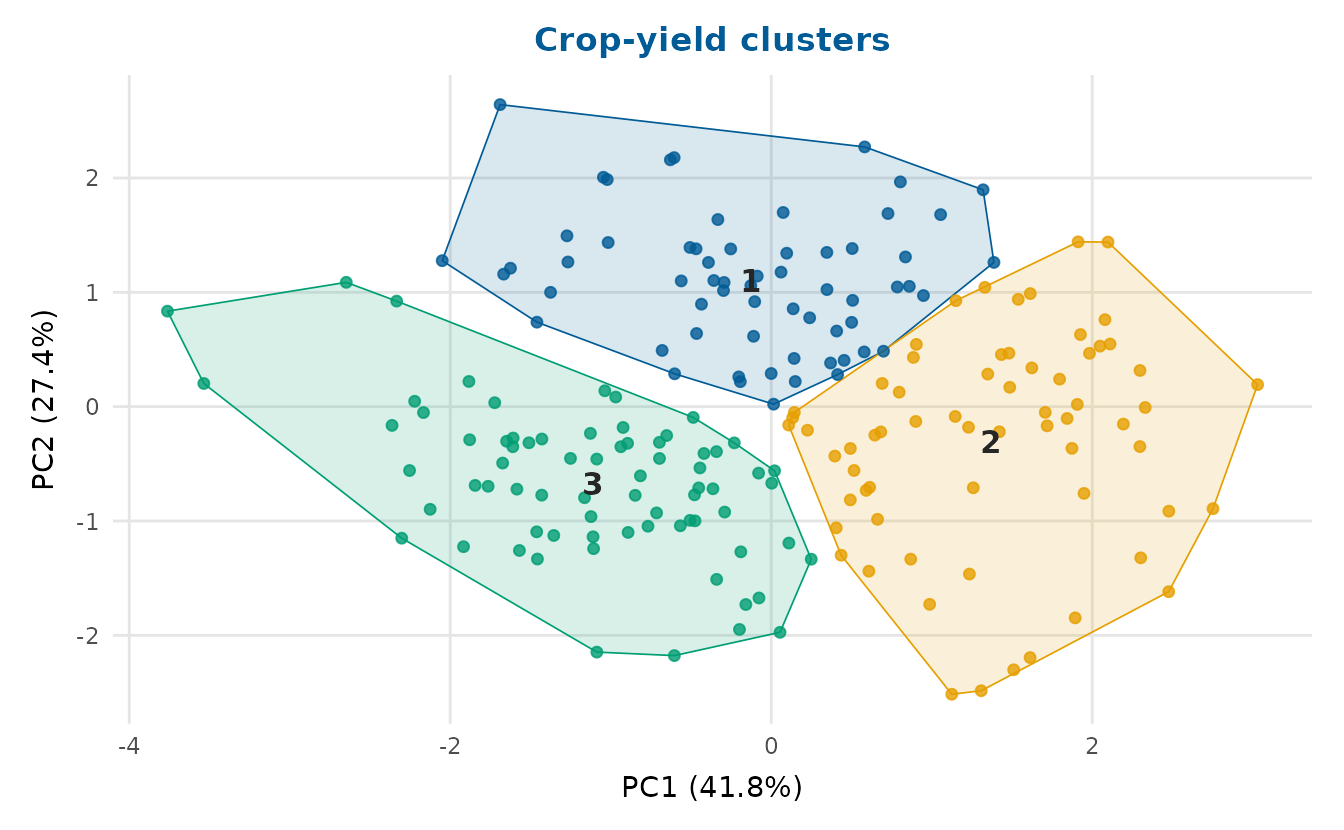
region_means <- aggregate(
  cbind(stress, sleep_hours, life_satisfaction, age, income) ~ region,
  data = wellbeing_survey, FUN = mean
)
rownames(region_means) <- region_means$region
dendrogram_plot(region_means[-1], k = 2, title = "Regions clustered")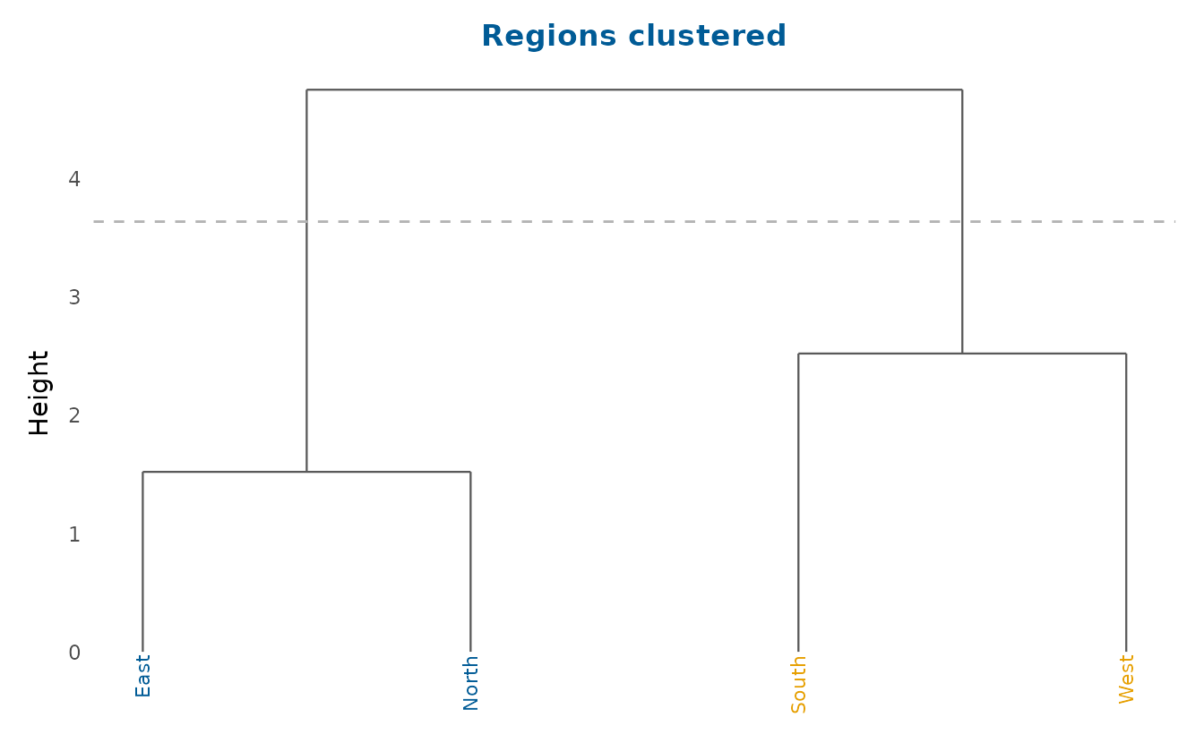
Choosing the number of clusters
Choosing k should not be guesswork.
k_diagnostic() evaluates a cluster-quality criterion across
a range of k and suggests a value, using the average
silhouette width (the default, after Rousseeuw, 1987), the
within-sum-of-squares elbow or the gap statistic (Tibshirani et al.,
2001).
kd <- k_diagnostic(crop_yield, k_range = 2:6, cols = num,
                   method = "silhouette")
kd  # the diagnostic curve, with the suggested k marked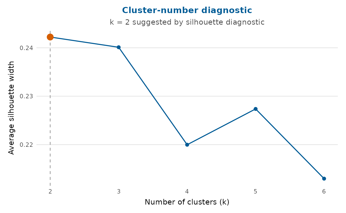
The suggested k and the underlying table are attached as
attributes:
attr(kd, "suggested")[1] 2| k | avg_silhouette |
|---|---|
| 2 | 0.242 |
| 3 | 0.240 |
| 4 | 0.220 |
| 5 | 0.227 |
| 6 | 0.213 |
The gap statistic compares the within-cluster dispersion against a
null reference, so unlike the other two criteria it can also support
k = 1, and its default search starts there. The elbow’s
default search starts at 1 as well. The elbow is the candidate farthest
from the line joining the first and last points of the curve, though, so
it never picks either end of the range. The silhouette width is
undefined for a single cluster, and its search starts at 2. The
reference samples are drawn at random, so the chunk is seeded for a
reproducible build.
set.seed(1)
k_diagnostic(crop_yield, cols = num, method = "gap")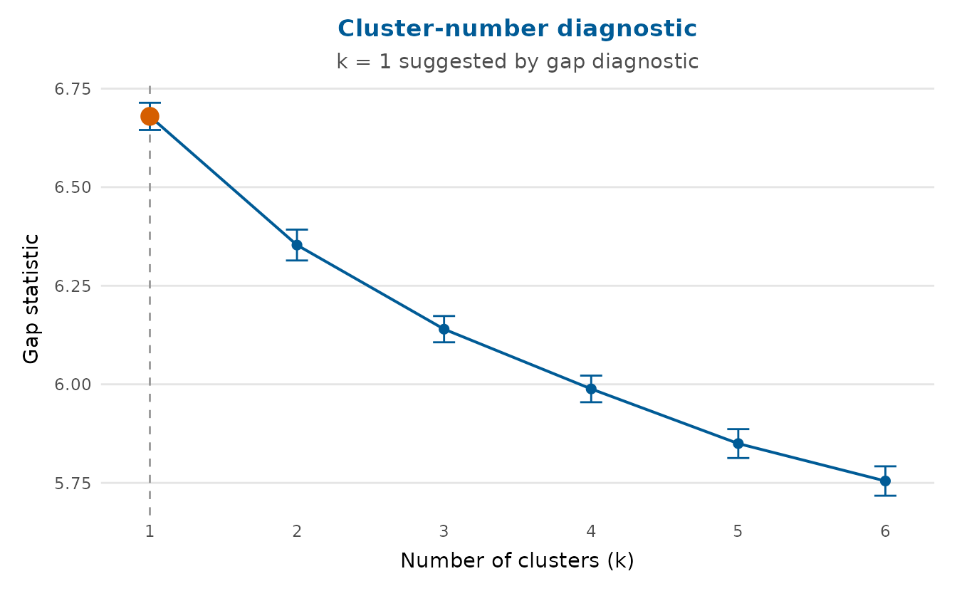
The verdict is k = 1, which is worth taking seriously:
the three-cluster partition drawn above is a description imposed on the
data rather than evidence of groups within it.
silhouette_plot() then shows the quality of an actual
clustering, one bar per observation grouped by cluster, with the average
silhouette width per cluster and overall (the dashed line). Wide
positive bars are well-placed observations, and a bar below zero marks
an observation that sits closer to a neighbouring cluster than to its
own.
set.seed(1)
cl <- kmeans(scale(crop_yield[num]), centers = attr(kd, "suggested"),
             nstart = 10)$cluster
silhouette_plot(crop_yield, cl, cols = num,
                title = "Silhouette widths by cluster")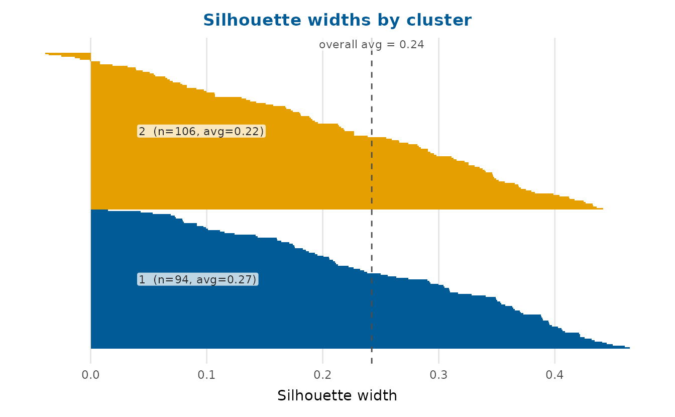
The overall average here is 0.24, and only six of the two hundred bars fall below zero, none of them by much. Rousseeuw’s rough guide treats an average at or below 0.25 as no substantial structure, so this figure agrees with the gap statistic: k-means returns clusters whether or not the data contains any, and the silhouette is one way of asking which case you are in.
The same diagnostics apply to the numeric profile of the wellbeing survey:
wb_num <- c("age", "income", "stress", "sleep_hours",
            "exercise_days", "life_satisfaction")
wkd <- k_diagnostic(wellbeing_survey, k_range = 2:6, cols = wb_num,
                    method = "wss")
wcl <- kmeans(scale(na.omit(wellbeing_survey[wb_num])),
              centers = attr(wkd, "suggested"), nstart = 10)$cluster
silhouette_plot(na.omit(wellbeing_survey[wb_num]), wcl,
                title = sprintf("Wellbeing survey, k = %d",
                                attr(wkd, "suggested")))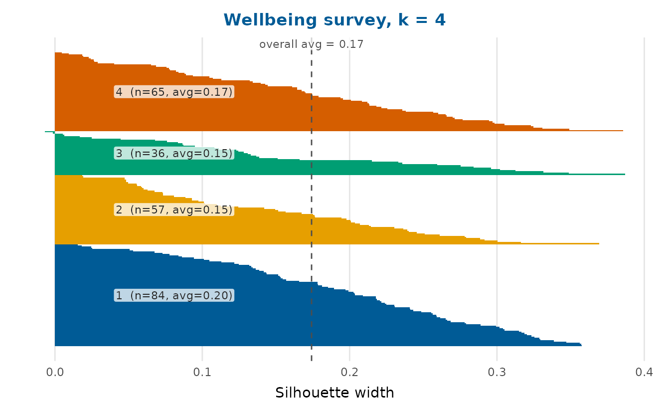
Survival curves
survival_plot() draws Kaplan-Meier curves (Kaplan & Meier,
1958) with stepwise confidence limits and censoring marks.
The limits come from Greenwood’s formula (Greenwood, 1926) on the log-log
scale, which keeps them between 0 and 1, and they cover better in small
samples than untransformed limits (Borgan & Liestøl, 1990).
conf_type = "plain" draws the untransformed limits and
conf_type = "log" the default of
survival::survfit(). The estimate is computed in base R, so
no modelling package is needed. You can pass follow-up times and an
event indicator directly, a data frame or a
survival::survfit object, whose limits are recomputed at
the requested conf_level.
The clinical_trial dataset has two arms with a real
survival difference (the treatment arm has a lower hazard), so the
curves separate. Turning on the three publication annotations gives a
survminer-style figure: a number-at-risk table beneath the curves,
dashed guides to each arm’s median survival and the log-rank test of the
difference as a subtitle. A survival curve is monotone-decreasing, so
its bottom-left corner is always empty, and
legend_inside = TRUE puts the group legend there.
survival_plot(
  clinical_trial$time, clinical_trial$event, group = clinical_trial$arm,
  risk_table = TRUE, median_line = TRUE, logrank = TRUE, legend_inside = TRUE,
  x_lab = "Months", title = "Overall survival by arm"
)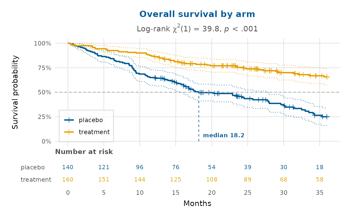
The log-rank p-value is tiny and the median survival is clearly longer in the treatment arm. Because its event times are longer, that arm is more often right-censored at the 36-month study end, visible as the denser run of censoring marks.