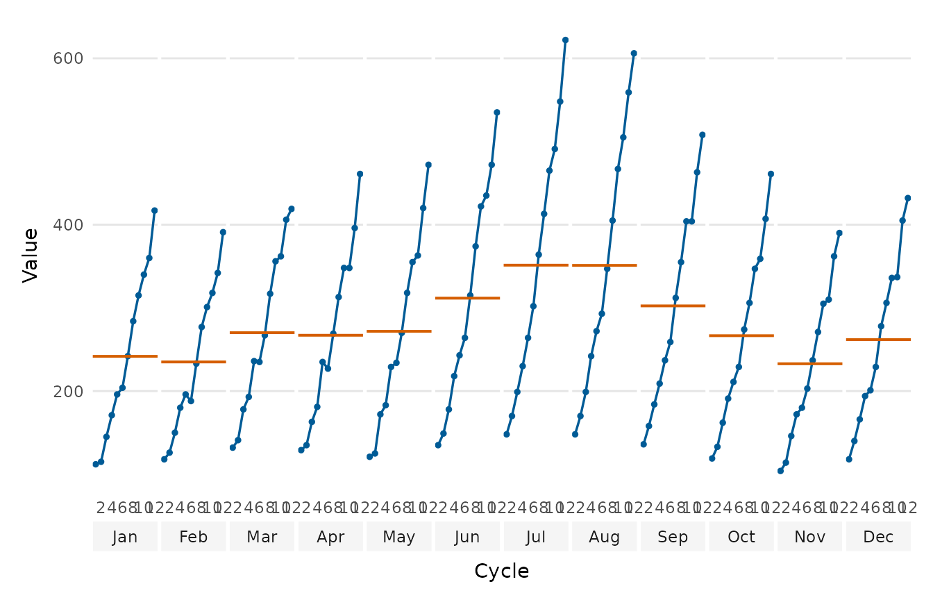
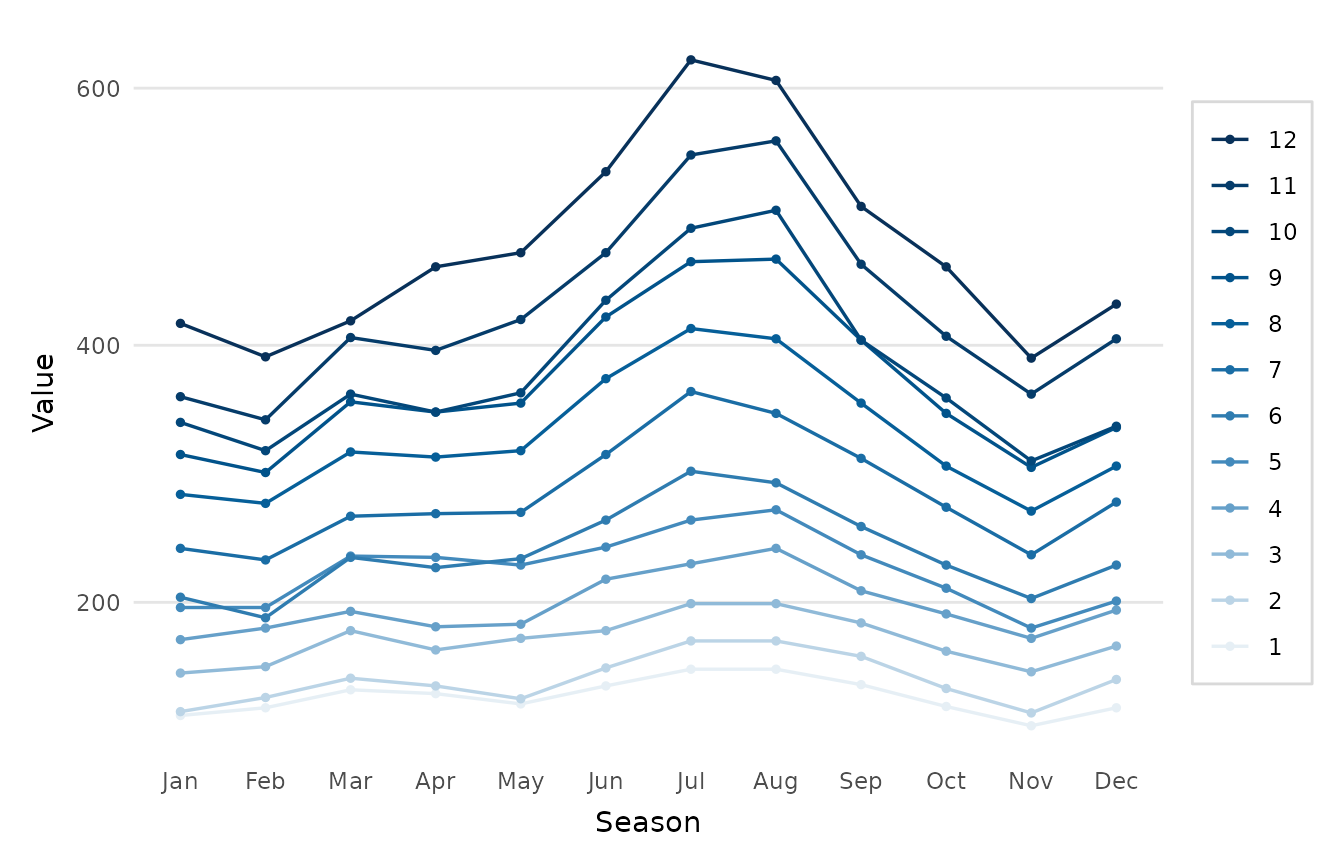
Draws a seasonal-subseries plot (also called a cycle plot): the series is split into one small panel per season (e.g. one panel per calendar month for monthly data), and within each panel the value is drawn across successive cycles (e.g. across years). A horizontal reference line in every panel marks that season's mean. This makes the seasonal pattern (differences between panels) and the within-season trend over time (the slope inside each panel) visible at the same time, which a single overlaid line cannot show.
Usage
seasonal_plot(
  x,
  frequency = NULL,
  style = c("subseries", "season"),
  season_labels = NULL,
  means = TRUE,
  point = TRUE,
  palette = NULL,
  title = NULL,
  x_lab = NULL,
  y_lab = NULL
)
Arguments
- x
A
tsobject, or a numeric vector (thenfrequencyis required), holding one series. A multivariatetsor a matrix with several columns is refused.- frequency
Number of observations per period (e.g. 12 for monthly data); taken from
xwhen it is ats. A frequency that is not a whole number, such as the 365.25 / 7 of weekly data, is rounded down to whole seasons, asstats::stl()rounds it, and a message says so. The seasons are then counted from the first observation.- style
"subseries"for the faceted cycle plot (one panel per season) or"season"for one line per cycle across the seasons.- season_labels
Optional character vector of length
frequencygiving the season (panel/axis) labels, e.g.month.abb. WhenNULL(default) sensible labels are inferred (month abbreviations for frequency 12, quarter labels for frequency 4, otherwise the season index).- means
Whether to draw the per-season mean reference line (
style = "subseries"only).- point
Whether to add points as well as the connecting line.
- palette
Colours used for the cycle lines when
style = "season". Defaults to a blue ramp from#4a8fc0through the brand blue to#08315a, whose palest colour has a contrast of 3.51:1 against white. The sequential ramp ofdepictr_palette()starts paler, at#e6eff5, which suits a fill but leaves a line close to invisible.- title, x_lab, y_lab
Title and axis labels.
Value
A ggplot2::ggplot object.
Details
Two layouts are offered. With style = "subseries" (the default) the panels
are faceted side by side, each tracing one season across cycles: the
classic Cleveland cycle plot, matching feasts::gg_subseries(). With
style = "season" every cycle is drawn as its own line over the seasons on a
shared axis (the seasonal-plot layout of forecast::ggseasonplot()), which is
handy for spotting an unusual year. The lines run from a mid blue for the
first cycle to a dark blue for the last, so they read in time order. Past
about six cycles, neighbouring cycles take colours too close to tell apart,
and the colours then show the order of the cycles more than which is which.
When individual cycles must be told apart, use style = "subseries", where
each cycle keeps its own place on the axis of every panel, or plot fewer
cycles.