
A common bibliometric question is not how large a literature is, but
how its internal emphasis shifts over time. Within deep-learning
research, say, is the share of work that also concerns medical imaging
growing faster than the share about computer vision?
scopus_compare_topics() answers exactly this, and
plot_scopus_comparison() shows the answer. The comparison
itself contacts the API, so it is shown but not run. The plotting is
reproduced offline from an object of the same shape.
What the comparison measures
For each year and each comparison term, the function counts the records matching the reference topic and that term, and expresses it as a percentage of the records matching the reference alone. A value of 30% for ‘computer vision’ in 2020 means that 30% of the deep-learning records that year also mention computer vision. The reference is the denominator, so it sits at 100% by construction and is not drawn.
cmp <- scopus_compare_topics(
  reference_query  = "deep learning",
  comparison_terms = c("computer vision", "natural language processing",
                       "medical imaging", "drug discovery"),
  years            = 2013:2021,
  field            = "TITLE-ABS-KEY"
)
The shape of the result
The result is a tidy table with one row per topic and year. A comparison counts whole literatures, so unlike a trend it cannot be derived from the corpus the package bundles for its other examples. The table below is rebuilt in the same shape, with illustrative counts, so the rest of the article runs without a key. The reference set grows over the period, which the uncertainty band will reflect.
years <- 2013:2021
ref_n <- round(seq(400, 1600, length.out = length(years)))
mk <- function(from, to) round(seq(from, to, length.out = length(years)))
counts <- list(
  "computer vision" = mk(140, 720),
  "natural language processing" = mk(90, 540),
  "medical imaging" = mk(15, 260),
  "drug discovery" = mk(8, 170)
)
cmp <- tibble::tibble(
  query = "q",
  query_type = c(rep("reference", length(years)),
                 rep("comparison", length(counts) * length(years))),
  abridged_query = c(rep("deep learning", length(years)),
                     rep(names(counts), each = length(years))),
  year = rep(years, length(counts) + 1),
  n = c(ref_n, unlist(counts, use.names = FALSE)),
  reference_n = rep(ref_n, length(counts) + 1),
  comparison_percentage = 100 * c(ref_n, unlist(counts, use.names = FALSE)) /
    rep(ref_n, length(counts) + 1),
  average_comparison_percentage = c(rep(100, length(years)),
                                    rep(c(40, 33, 15, 9), each = length(years)))
)
class(cmp) <- c("scopus_comparison", class(cmp))

# The whole table is too long to read here, so show its first year across every
# topic. The `query` column is left out because a real comparison carries the
# whole query string sent to the API in it, which is too long for a table. The
# illustrative table built above holds a placeholder there instead.
cmp[cmp$year == min(cmp$year), setdiff(names(cmp), "query")]| query_type | abridged_query | year | n | reference_n | comparison_percentage | average_comparison_percentage |
|---|---|---|---|---|---|---|
| reference | deep learning | 2013 | 400 | 400 | 100.00 | 100 |
| comparison | computer vision | 2013 | 140 | 400 | 35.00 | 40 |
| comparison | natural language processing | 2013 | 90 | 400 | 22.50 | 33 |
| comparison | medical imaging | 2013 | 15 | 400 | 3.75 | 15 |
| comparison | drug discovery | 2013 | 8 | 400 | 2.00 | 9 |
Those are the five rows for the first year, one for the reference and
one for each comparison term. The whole table has 45 rows on the same
pattern. The query column left out above is still in the
object. A real comparison carries the whole query behind each count
there, where this illustrative table carries a placeholder.
The comparison_percentage column is the per-year share,
and average_comparison_percentage is the same ratio
computed over the whole period, which is what orders the topics. A year
in which the reference has no records has no defined share, so it is
recorded as NA. A zero there would be read as a real
observation.
A first plot
Drawing the comparison takes one call on the result.
plot_scopus_comparison(cmp, legend_inside = TRUE)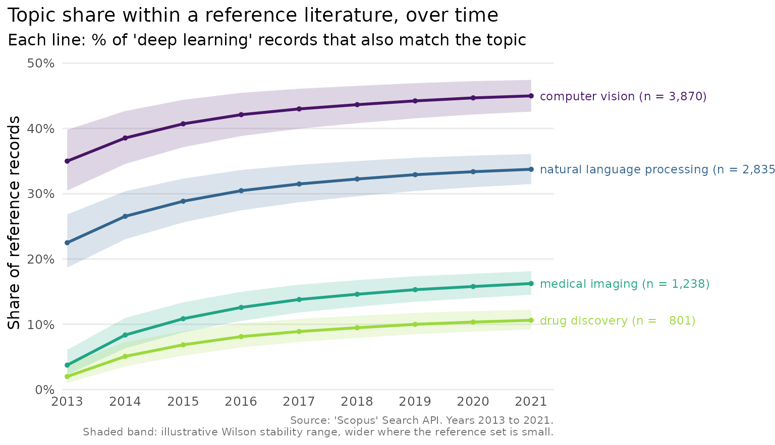
Here legend_inside = TRUE places the topic key inside
the panel, in whichever corner has the most free space. Left at its
default the chart labels each line at its end, and uses whole-number
year breaks and a colour-blind-safe palette, so with only a few topics
the reader never has to match colours to a legend at all. Each label
carries the topic’s total record count. The shaded band around each line
is a Wilson stability range. It is wide in the early years, when the
reference set is small and the share would move easily, and narrows as
the literature grows. ‘Scopus’ returns exact counts, so nothing here is
a sample from which an interval could be estimated. The band is
illustrative, a point the plot_scopus_comparison() help
page sets out.
When lines converge at the right end
Direct labels are legible only if they do not overlap, and topics
sometimes end the period at nearly the same share.
plot_scopus_comparison() spreads converging labels apart
automatically, at the point the figure is actually drawn, so they stay
readable at any figure size and never stack into an unreadable pile.
Here six sub-areas of materials-science research all end 2013–2021
within three points of one another.
years <- 2013:2021
ends <- c(18, 18.6, 19.2, 19.8, 20.4, 21)
names(ends) <- c(
  "graphene", "perovskites", "MXenes", "COFs", "MOFs", "aerogels"
)
ref_n <- round(seq(500, 2000, length.out = length(years)))
converge <- function(end) round(end *
  (0.5 + 0.5 * (0:(length(years) - 1)) / (length(years) - 1)) * ref_n / 100)
counts <- lapply(ends, converge)

cmp_converging <- tibble::tibble(
  query = "q",
  query_type = c(rep("reference", length(years)),
                 rep("comparison", length(counts) * length(years))),
  abridged_query = c(rep("energy materials", length(years)),
                     rep(names(counts), each = length(years))),
  year = rep(years, length(counts) + 1),
  n = c(ref_n, unlist(counts, use.names = FALSE)),
  reference_n = rep(ref_n, length(counts) + 1),
  comparison_percentage = 100 * c(ref_n, unlist(counts, use.names = FALSE)) /
    rep(ref_n, length(counts) + 1),
  average_comparison_percentage = c(rep(100, length(years)),
                                    rep(ends, each = length(years)))
)
class(cmp_converging) <- c("scopus_comparison", class(cmp_converging))
plot_scopus_comparison(cmp_converging)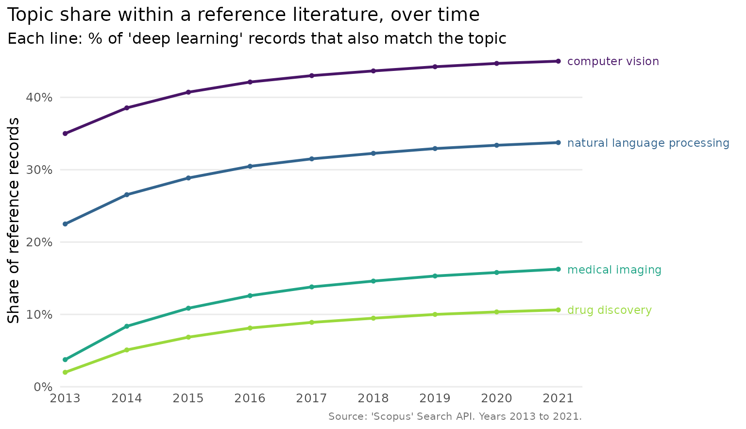
Without this, six labels ending within three points of each other would print on top of one another. Here every one is still readable, each colour-matched to its own line and spread in the same order as the line ends.
Drawing the eye to one topic
When one topic is the focus of a figure, highlight draws
it in an accent colour and greys the rest, which keeps the context
visible without letting it compete.
plot_scopus_comparison(cmp, highlight = "medical imaging")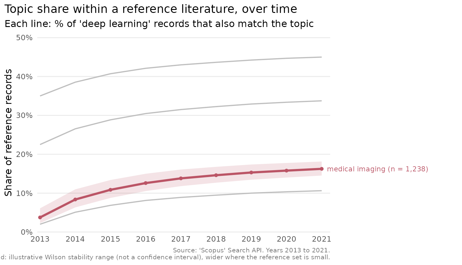
Adjusting the labels
The count suffix on each label can be turned off, and the uncertainty band can be removed, when a cleaner look is wanted.
plot_scopus_comparison(cmp, pub_count_in_legend = FALSE, interval = FALSE)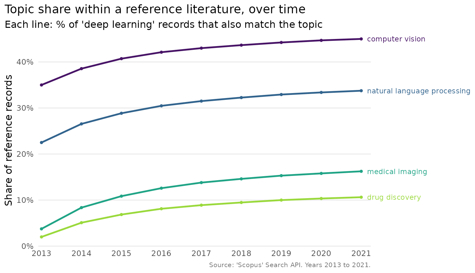
The return value is an ordinary ggplot2 object, so any further
adjustment, a different theme or a saved file, is one + or
one ggplot2::ggsave() away.
Reading the result as a table
Sometimes the numbers matter more than the picture. Because the output is a tibble, the usual tools apply. Here are the topics ranked by their average share.
comp <- cmp[cmp$query_type == "comparison", ]
unique(comp[, c("abridged_query", "average_comparison_percentage")])| abridged_query | average_comparison_percentage |
|---|---|
| computer vision | 40 |
| natural language processing | 33 |
| medical imaging | 15 |
| drug discovery | 9 |