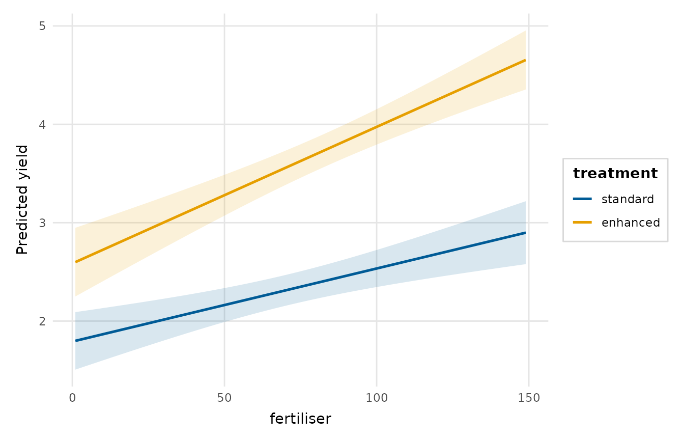
Shows how the predicted relationship between a focal predictor and the response changes across the levels (or representative values) of a second, moderating predictor. Other predictors are held at typical values.
Usage
interaction_plot(
  model,
  predictor,
  moderator,
  moderator_values = NULL,
  conf_level = 0.95,
  n = 80,
  band = TRUE,
  palette = NULL,
  title = NULL,
  x_lab = NULL,
  y_lab = NULL
)
Arguments
- model
A fitted model (
lm,glm,merMod, ...).- predictor
Name of the focal predictor on the x-axis (string), given as in
effects_plot():"log(rainfall)"meansrainfall.- moderator
Name of the moderating predictor, mapped to colour (string), given in the same way as
predictor. It must be a different variable.- moderator_values
For a numeric moderator, the values to show, on the variable's own scale. Defaults to the 10th, 50th and 90th percentiles in the estimation sample.
- conf_level
Confidence level for the bands/intervals, a single number strictly between 0 and 1.
- n
Number of points across the range of a numeric focal predictor.
- band
Whether to draw confidence bands (numeric focal predictor).
- palette
Colours for the moderator; defaults to
depictr_palette().- title, x_lab, y_lab
Title and axis labels.
Value
A ggplot2::ggplot object.
Details
The grid is built as in effects_plot(). It holds the raw variables, so
transformed terms are predicted as fitted. Typical values come from the
estimation sample, and an offset is held at its mean on the link scale.
Examples
fit <- lm(yield ~ fertiliser * treatment + rainfall, data = crop_yield)
interaction_plot(fit, "fertiliser", "treatment")