Plots the receiver operating characteristic (ROC) curve for a binary
classifier and reports the area under the curve (AUC). The input can be a
fitted binomial glm, a pair of vectors (observed binary outcome and a
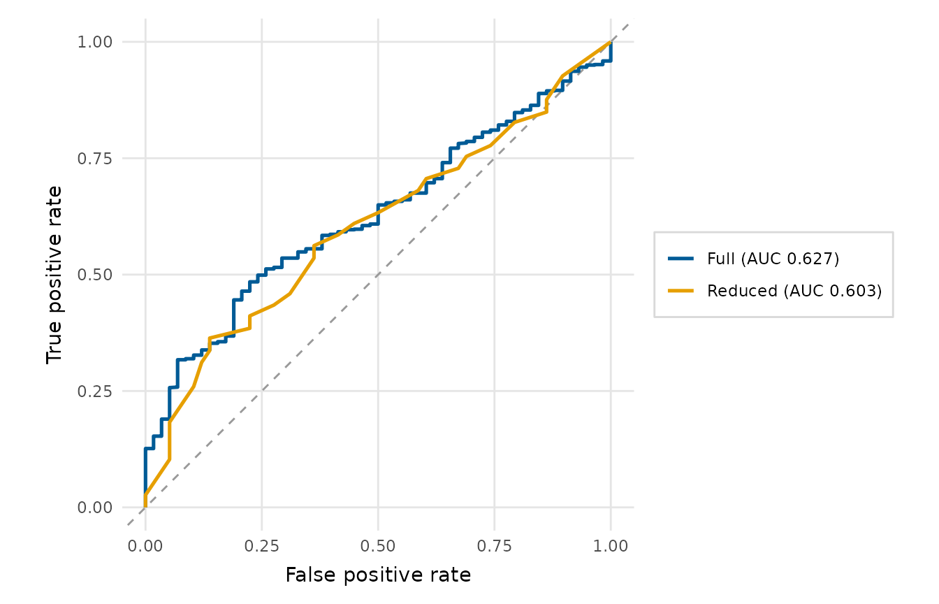
continuous score), or, to compare several models, a named list of
models or of (actual, score) pairs, which are overlaid as colour-coded curves
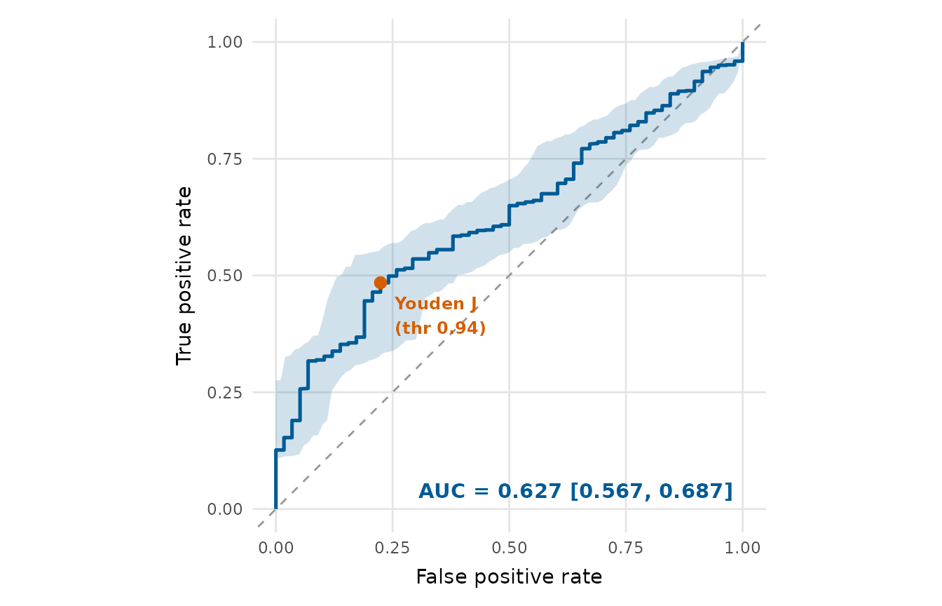
with a legend and a per-curve AUC. An optional bootstrap confidence band can
be drawn for the (single-model) curve and its AUC, and the Youden's J
operating point can be marked.
Usage
roc_curve_plot(
  x,
  score = NULL,
  colour = depictr_brand(),
  ci = FALSE,
  conf_level = 0.95,
  youden = FALSE,
  legend_inside = FALSE,
  title = NULL
)
Arguments
- x
A binomial
glm; the vector of observed outcomes (0/1, logical or a two-level factor with the positive class second); or a named list of models / (actual, score) pairs to overlay (see Details).- score
When
xis an outcome vector, the matching vector of scores or predicted probabilities. Whenxis a named list of outcome vectors, a matching named/positional list of score vectors.- colour
Curve colour for the single-model case. Defaults to the depictr brand blue. Ignored when several models are overlaid (the colourblind-aware
scale_colour_depictr()palette is used instead).- ci
Bootstrap confidence band for a single ROC curve and its AUC.
FALSE(default) draws none;TRUEuses 2000 resamples; a positive integer sets the number of resamples. Ignored when several models are overlaid.- conf_level
Confidence level for the bootstrap band, a single number strictly between 0 and 1.
- youden
Logical; if
TRUE, mark the Youden's J operating point (the threshold maximising sensitivity + specificity - 1) on each curve.- legend_inside
When
TRUE(and several models are overlaid), draw the legend inside the panel (in the bottom-right corner the curve leaves empty) over a translucent background, instead of in a right-hand margin. Defaults toFALSE.- title
Plot title.
Value
A ggplot2::ggplot object. The AUC(s) are stored in
attr(plot, "auc") (a named vector when several models are supplied).
Details
A named list overlays one curve per element, e.g.
roc_curve_plot(list("Full" = fit_full, "Reduced" = fit_reduced)). Each
element may be a glm, a length-2 list/data frame of (actual, score), or an
outcome vector paired with the matching element of a score list.
Examples
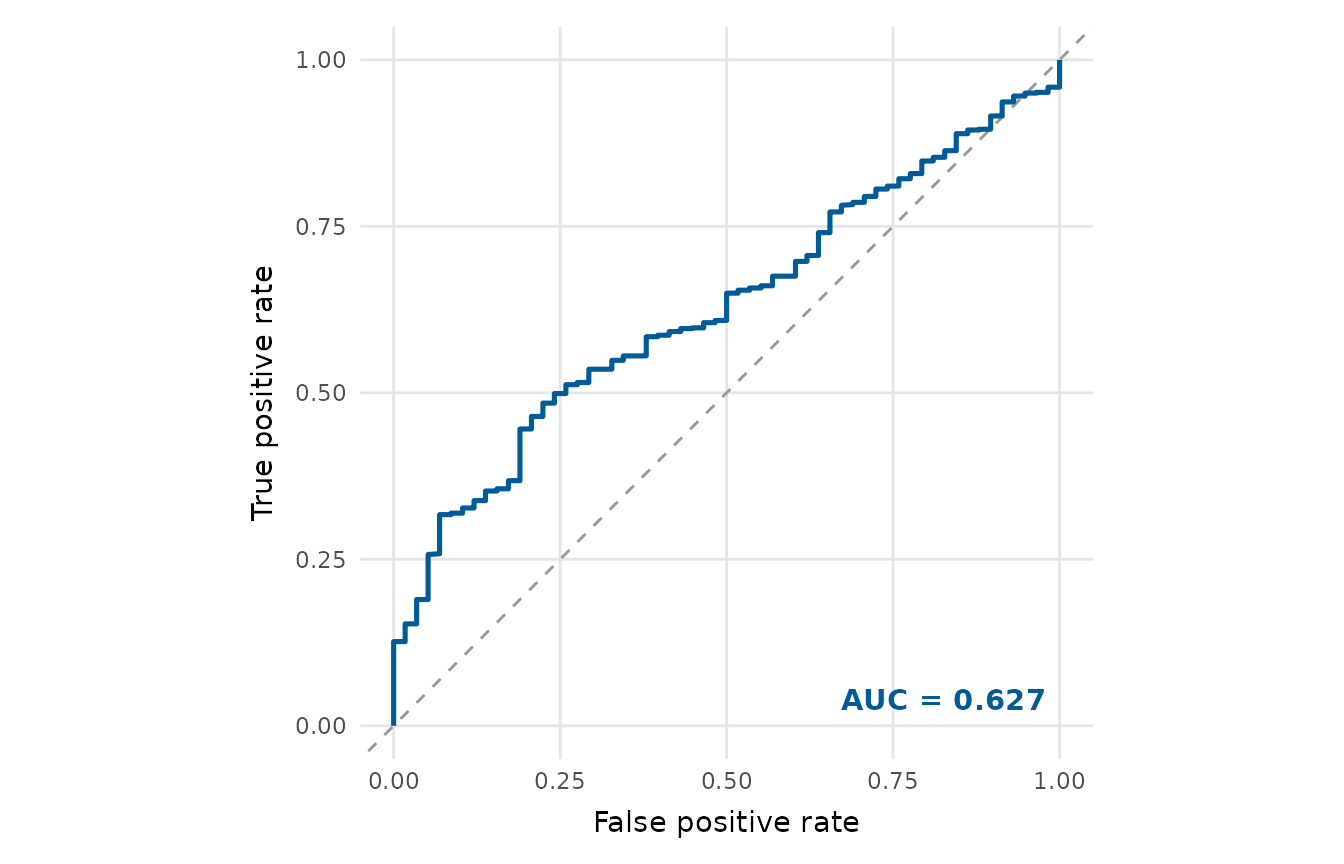
gfit <- glm(accuracy ~ word_frequency + condition + RT,
data = lexical_decision, family = binomial)
roc_curve_plot(gfit)
 # Mark the Youden operating point and add a bootstrap band.
roc_curve_plot(gfit, youden = TRUE, ci = 200)
# Mark the Youden operating point and add a bootstrap band.
roc_curve_plot(gfit, youden = TRUE, ci = 200)
 # Compare two models with a colour-coded legend and per-curve AUC.
reduced <- glm(accuracy ~ word_frequency, data = lexical_decision,
family = binomial)
roc_curve_plot(list(Full = gfit, Reduced = reduced))
# Compare two models with a colour-coded legend and per-curve AUC.
reduced <- glm(accuracy ~ word_frequency, data = lexical_decision,
family = binomial)
roc_curve_plot(list(Full = gfit, Reduced = reduced))