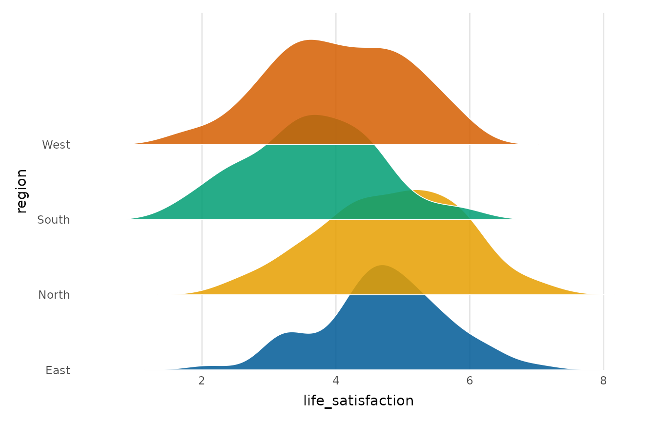
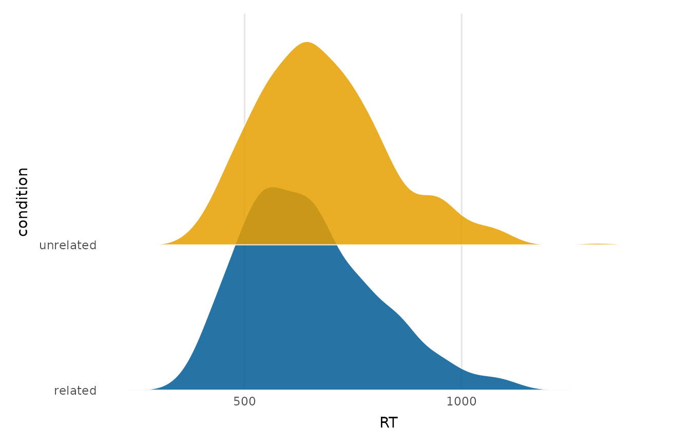
Shows the distribution of a numeric variable across the levels of a grouping variable as a column of partially overlapping density curves, one ridge per group, stacked up the y-axis. It compares many distributions in a compact space, making shifts in location and shape easy to follow, and is a clearer choice than many overlaid densities once there are several groups.
Usage
ridgeline_plot(
  data,
  x,
  group,
  overlap = 1.4,
  alpha = 0.85,
  scale_height = TRUE,
  palette = NULL,
  title = NULL,
  x_lab = NULL,
  y_lab = NULL
)
Arguments
- data
A data frame.
- x
The numeric variable whose distribution is shown (string or unquoted name).
- group
The grouping variable (string or unquoted name); one ridge per level. A numeric code counts as a group, but a numeric column with more than 20 distinct values is refused as continuous. Rows with a missing group are dropped with a message, and levels without rows are left out of the plot and its palette.
- overlap
How far each ridge extends into the next, as a multiple of the row spacing.
1makes the tallest ridge just touch the next baseline; larger values overlap more. Defaults to1.4.- alpha
Fill transparency of the ridges.
- scale_height
Whether to scale every ridge to the same peak height (
TRUE, the default) or keep the true relative densities (FALSE).- palette
Colours for the groups; defaults to
depictr_palette().- title, x_lab, y_lab
Plot title and axis labels.
Value
A ggplot2::ggplot object.
Details
Densities are computed with stats::density() and scaled to a common height;
the overlap argument controls how far each ridge reaches into the one above.
Groups with fewer than two non-missing values are dropped with a warning. The
implementation is base R + ggplot2, with no extra package dependency.