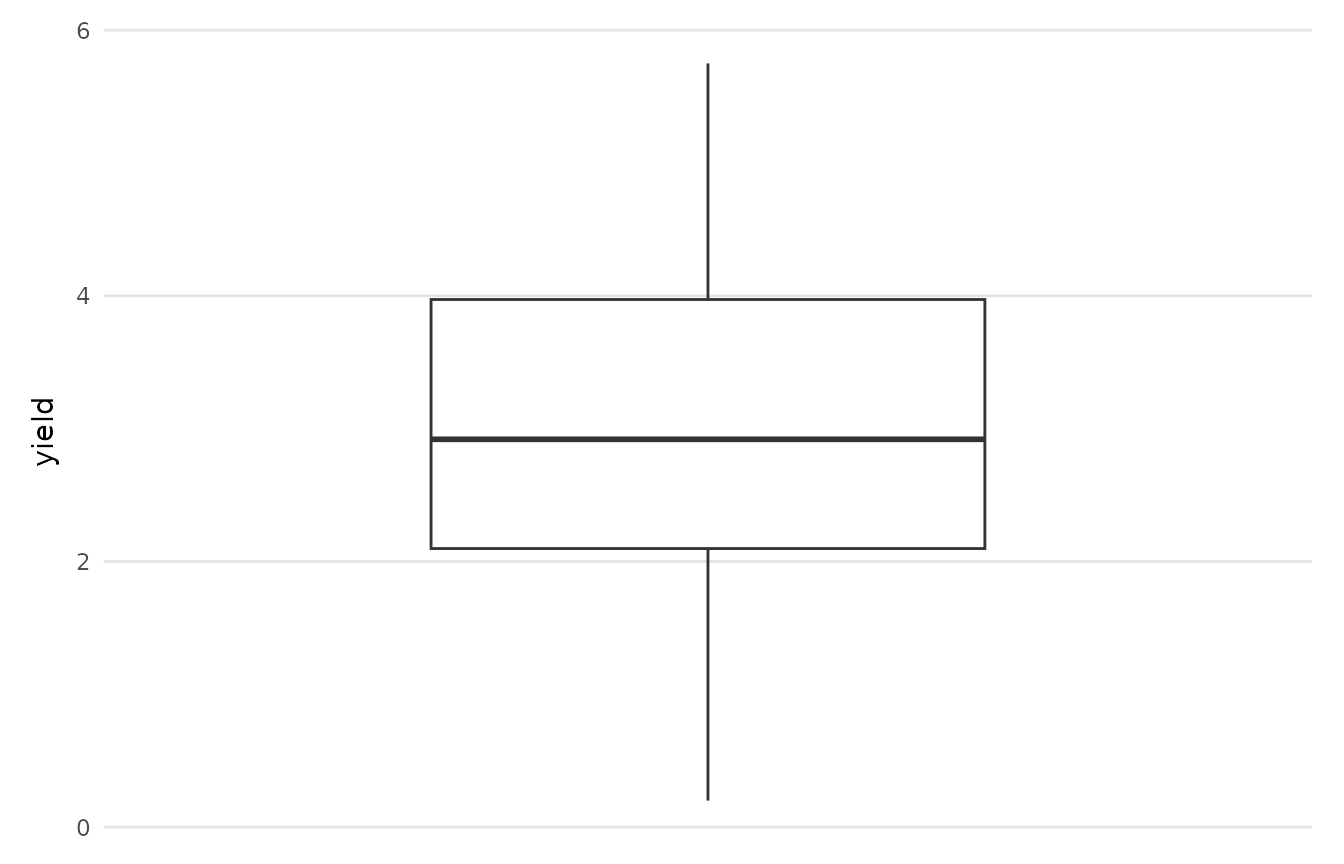
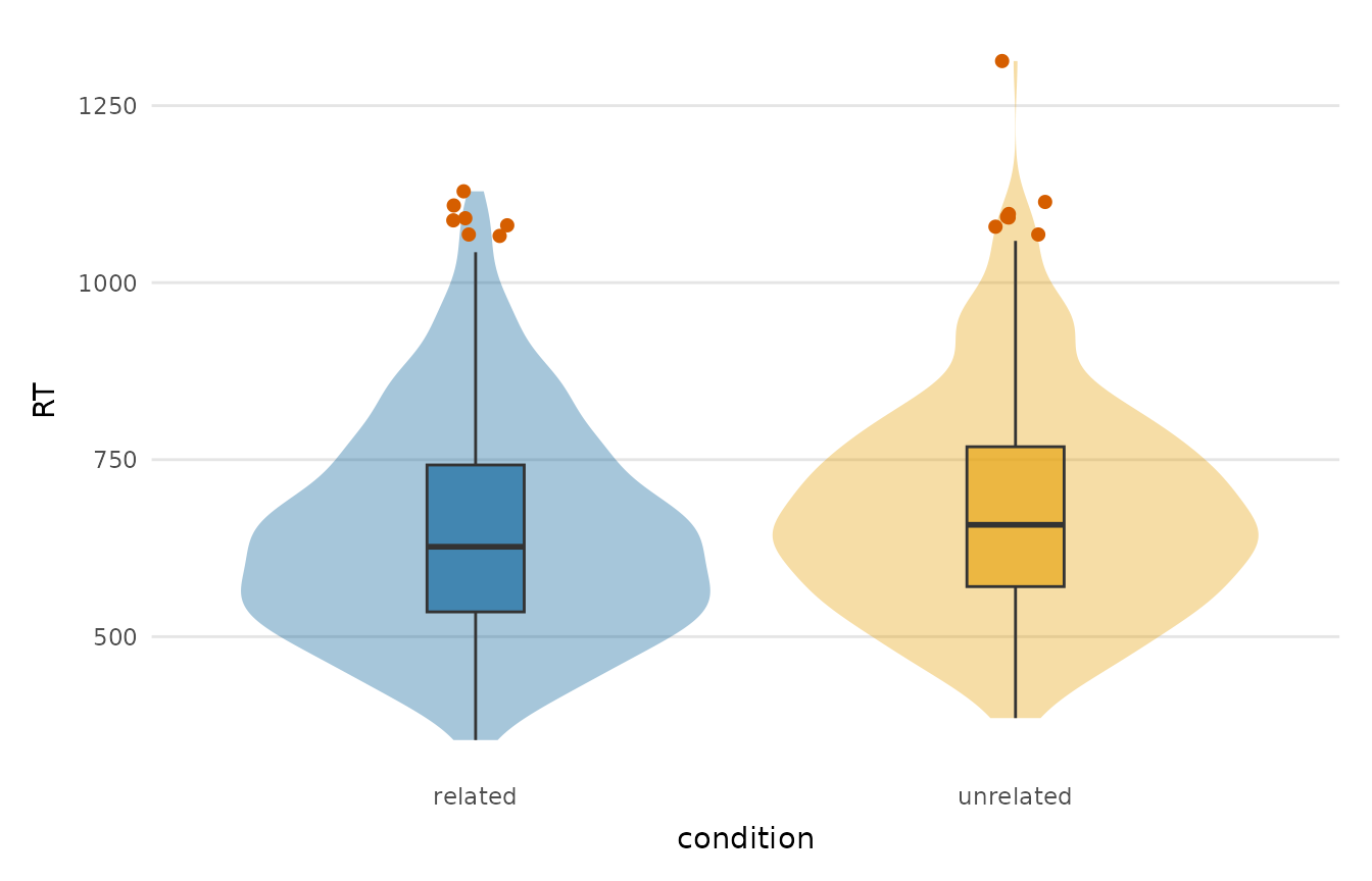
Shows the distribution of a numeric variable (optionally by group) as a box and/or violin plot, with points beyond the 1.5 * IQR fences highlighted so that outliers are easy to spot before modelling.
Usage
outlier_plot(
  data,
  y,
  group = NULL,
  type = c("box", "violin", "both"),
  flag = TRUE,
  outlier_colour = depictr_accent(),
  palette = NULL,
  title = NULL,
  y_lab = NULL
)
Arguments
- data
A data frame.
- y
The numeric variable (string or unquoted name).
- group
Optional grouping variable on the x-axis. A numeric code counts as a group, but a numeric column with more than 20 distinct values is refused as continuous. Rows with a missing group are dropped with a message, and levels without rows are left out of the plot and its palette.
- type
One of
"box","violin"or"both".- flag
Whether to highlight outliers (points beyond 1.5 * IQR).
- outlier_colour
Colour for highlighted outliers.
- palette
Colours for the groups; defaults to
depictr_palette().- title, y_lab
Plot title and value-axis label.
Value
A ggplot2::ggplot object.