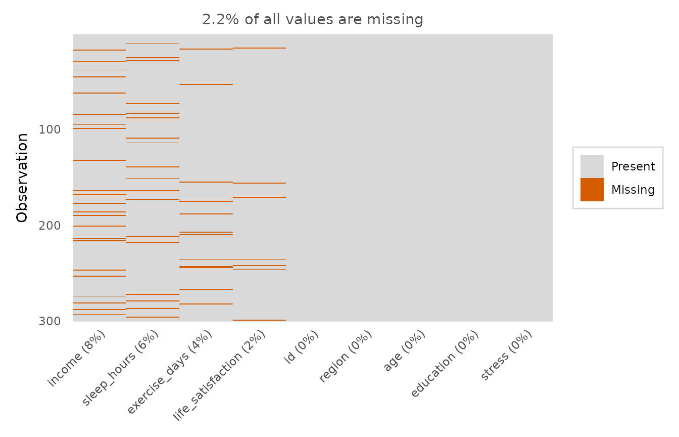
Draws a tile map of the data frame with one column per variable and one row per observation, shading the cells that are missing. The variables are ordered by their proportion of missing values, and that proportion is shown in the axis labels, making it easy to spot variables and patterns that need attention before modelling.
Usage
missingness_map(
  data,
  cols = NULL,
  sort = TRUE,
  show_pct = TRUE,
  colours = c("grey85", depictr_accent()),
  legend_inside = FALSE,
  title = NULL
)
Arguments
- data
A data frame.
- cols
Optional character vector of columns to include (default: all).
- sort
Whether to order variables by their proportion of missing values.
- show_pct
Whether to append the percentage missing to each variable label.
- colours
Length-2 vector: colours for present and missing cells. Defaults to a muted grey for present cells and the colourblind-safe
depictr_palette()accent for missing cells.- legend_inside
When
TRUE(andsort = TRUE), draw the legend inside the panel, in the top-right (where the most-complete columns put a solid "Present" block, so it hides no "Missing" mark) instead of in a right-hand margin. Defaults toFALSE.- title
Plot title.
Value
A ggplot2::ggplot object.