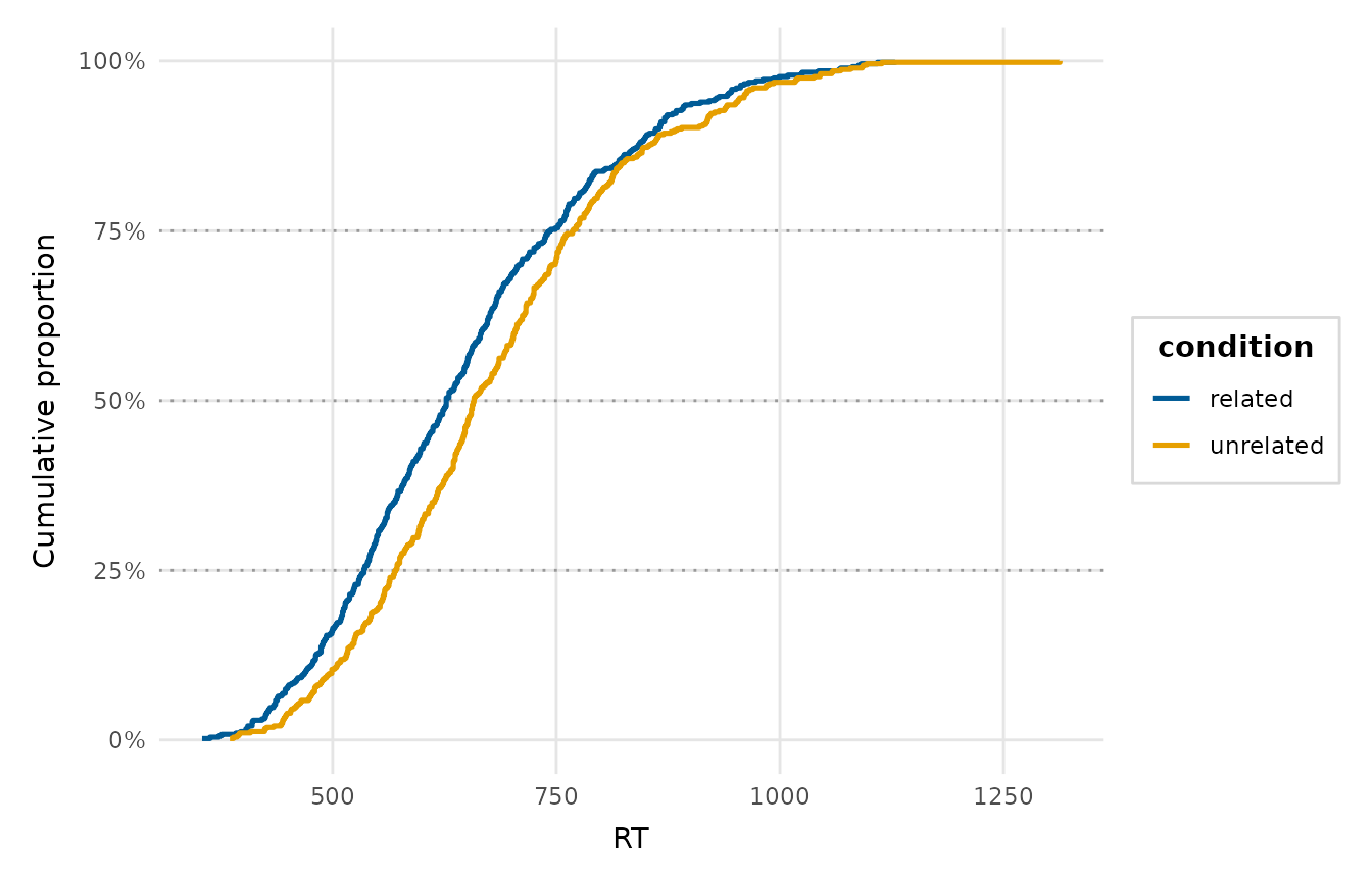
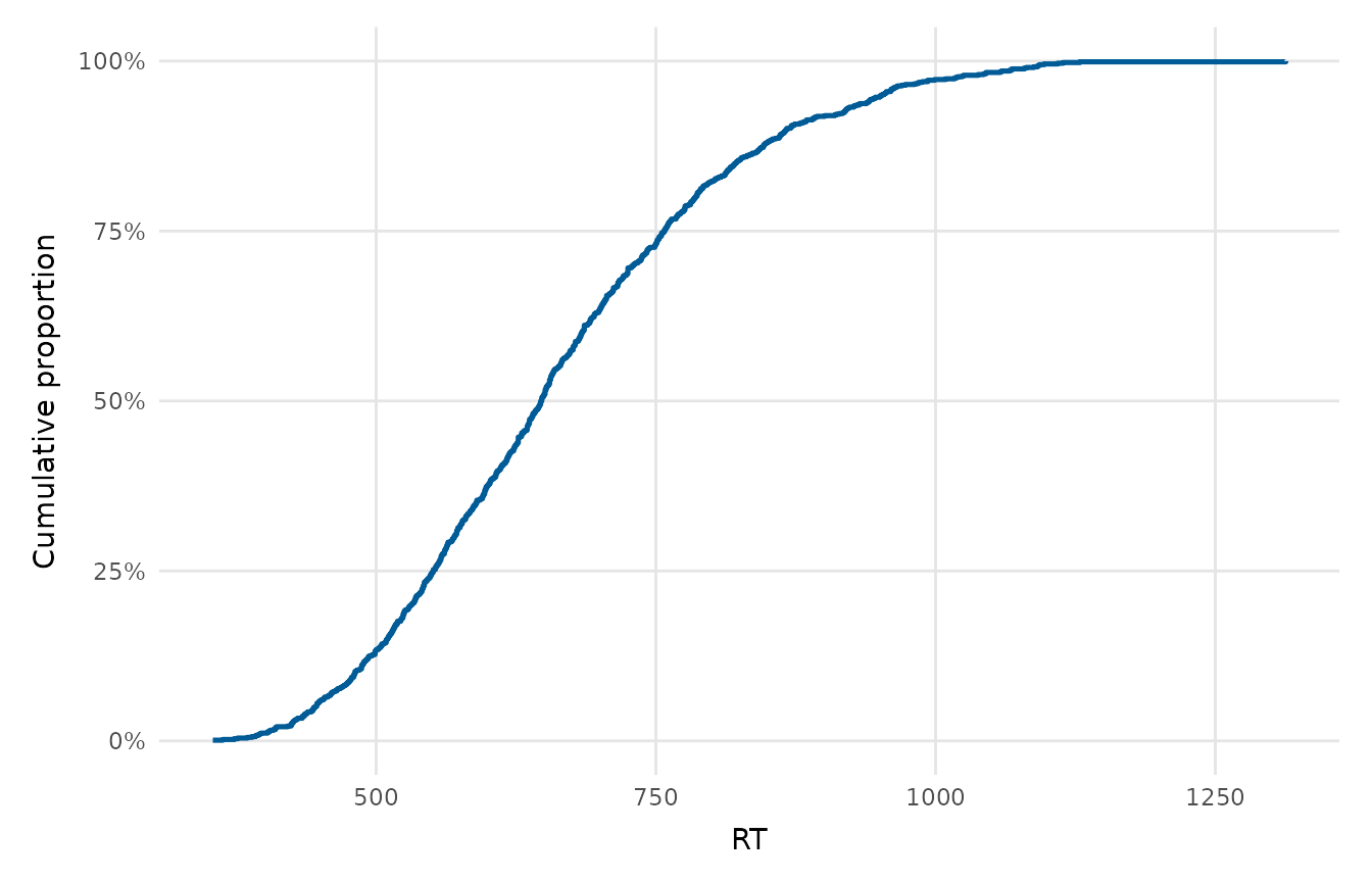
Draws the empirical CDF of a numeric variable (the proportion of observations at or below each value), optionally split by a grouping variable. Unlike a histogram it needs no bin-width choice and makes quantiles, medians and group shifts easy to read directly off the curve.
Usage
ecdf_plot(
  data,
  x,
  group = NULL,
  reference_quantiles = NULL,
  palette = NULL,
  legend_inside = FALSE,
  title = NULL,
  x_lab = NULL,
  y_lab = "Cumulative proportion"
)
Arguments
- data
A data frame.
- x
The numeric variable (string or unquoted name).
- group
Optional grouping variable (string or unquoted name) mapped to colour, giving one ECDF per group. A numeric code counts as a group, but a numeric column with more than 20 distinct values is refused as continuous. Rows with a missing group are dropped with a message, and levels without rows are left out of the plot and its palette.
- reference_quantiles
Optional numeric vector of probabilities in [0, 1] to mark with light horizontal guides (e.g.
c(0.25, 0.5, 0.75));NULL(the default) draws none.- palette
Colours for the groups; defaults to
depictr_palette().- legend_inside
When
TRUE(and agroupis given), draw the legend inside the panel (in the bottom-right corner the ECDF leaves empty once it saturates) over a translucent background, instead of in a right-hand margin. Defaults toFALSE.- title, x_lab, y_lab
Plot title and axis labels.
Value
A ggplot2::ggplot object.
Examples
ecdf_plot(lexical_decision, RT)
 ecdf_plot(lexical_decision, RT, group = condition,
reference_quantiles = c(0.25, 0.5, 0.75))
ecdf_plot(lexical_decision, RT, group = condition,
reference_quantiles = c(0.25, 0.5, 0.75))