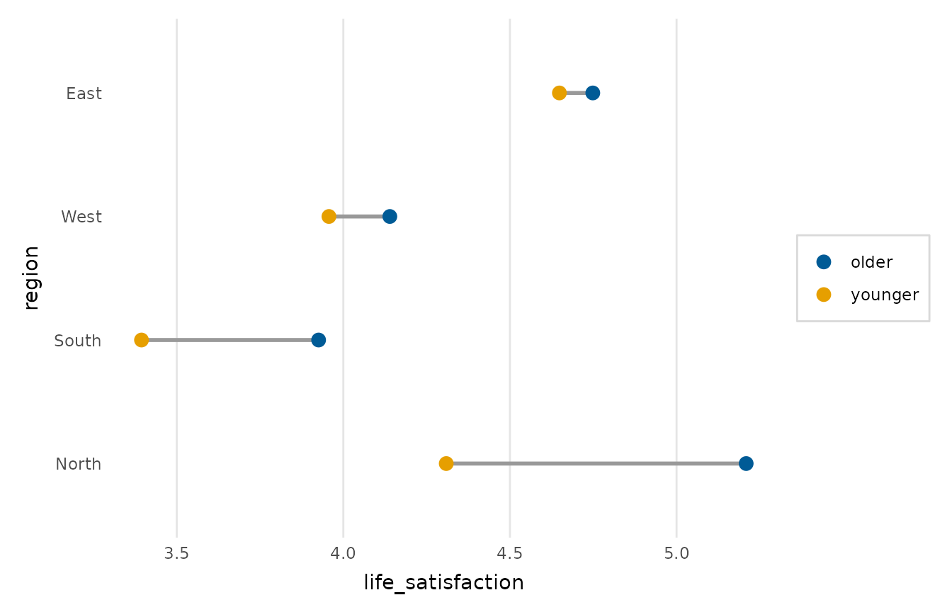
Compares a numeric value between exactly two groups across a set of categories: for each category the two group values are drawn as points joined by a connecting segment, so the size and direction of the gap is read at a glance. It is a clearer alternative to paired or grouped bars for before/after, two-condition or two-period comparisons.
Usage
dumbbell_plot(
  data,
  category,
  value,
  group,
  sort = c("gap", "value", "none"),
  point_size = 3,
  palette = NULL,
  legend_inside = FALSE,
  title = NULL,
  x_lab = NULL,
  y_lab = NULL
)
Arguments
- data
A data frame.
- category
The categorical axis (string or unquoted name); one row of the plot per level.
- value
The numeric value to compare (string or unquoted name).
- group
The two-level grouping variable whose levels are the two ends of each dumbbell (string or unquoted name).
- sort
How to order the categories up the axis:
"gap"(by the signed difference between the two groups, the default),"value"(by the second group's value), or"none"(the data's own order: the order of the levels whencategoryis a factor, and otherwise the order in which the categories first appear).- point_size
Size of the end points.
- palette
Length-2 colours for the two groups; defaults to
depictr_palette().- legend_inside
When
TRUE, draw the two-group legend inside the panel (in the top-right corner, which the default gap sort with the shortest dumbbell on top usually leaves clear) over a translucent background, instead of in a right-hand margin. Defaults toFALSE.- title, x_lab, y_lab
Plot title and axis labels.
Value
A ggplot2::ggplot object.