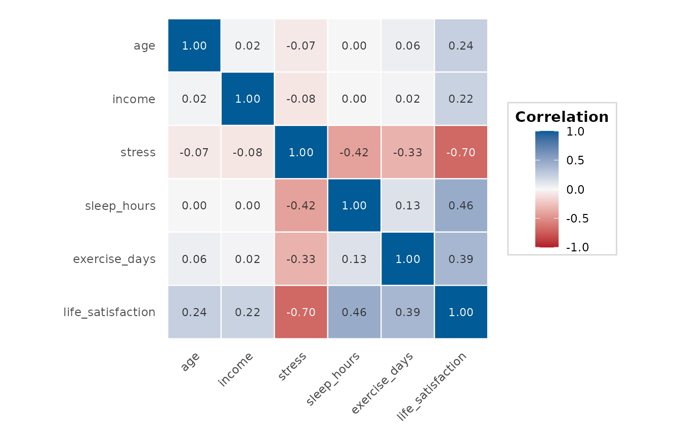
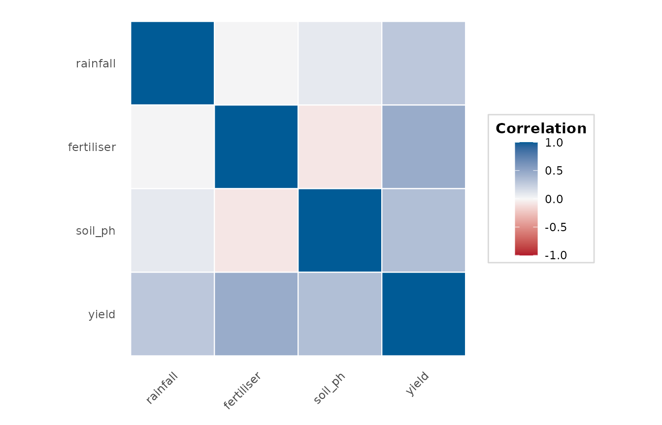
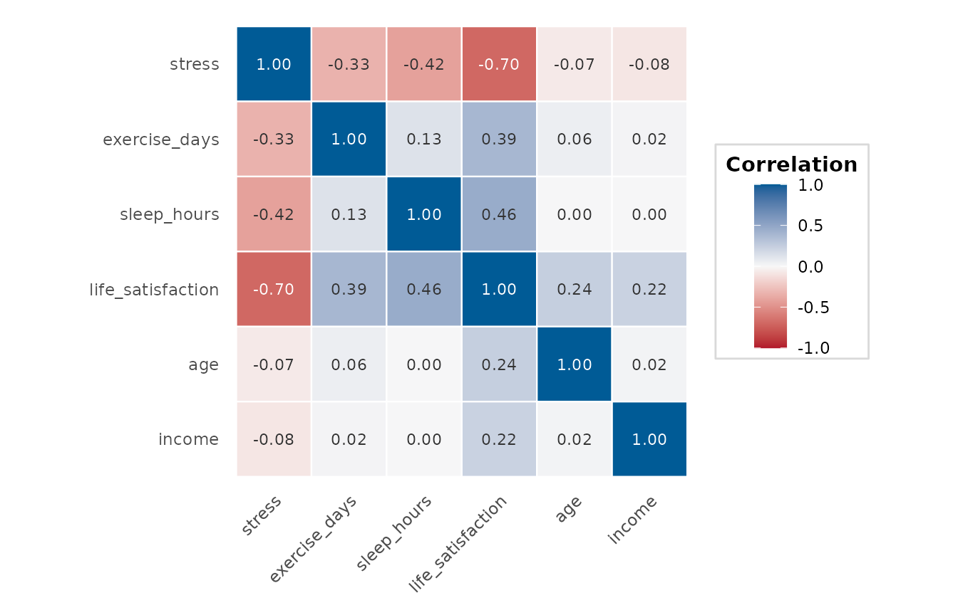
Computes the pairwise correlations between the numeric columns of a data frame and displays them as a colour-coded heatmap, optionally annotated with the correlation values.
Usage
correlation_heatmap(
  data,
  cols = NULL,
  method = "pearson",
  use = "pairwise.complete.obs",
  show_values = TRUE,
  digits = 2,
  palette = depictr_palette(5, "diverging")[c(1, 3, 5)],
  reorder = FALSE,
  title = NULL
)
Arguments
- data
A data frame.
- cols
Optional character vector of columns to include, each numeric or logical. Any other column, such as a factor or a date, is an error that names it. If
NULL, all numeric columns are used.- method
Correlation method:
"pearson","spearman"or"kendall".- use
Missing-value handling passed to
stats::cor().- show_values
Whether to annotate each cell with its correlation, drawn in black or white, whichever has the higher contrast against the cell.
- digits
Number of decimal places for the annotations.
- palette
Length-3 vector of colours for the lowest, mid (zero) and highest correlations. Defaults to the endpoints and midpoint of the colourblind-aware
depictr_palette()diverging ramp (negative correlations red, zero neutral, positive correlations brand blue).- reorder
Whether to reorder the variables by hierarchical clustering of the correlation matrix (using \(1 - r\) as the distance), so that blocks of mutually correlated variables sit together and structure is easier to see. Defaults to
FALSE(the order ofcols). Skipped with a message if any correlation is undefined (NA).- title
Plot title.
Value
A ggplot2::ggplot object.
Details
Columns with (near-)zero variance cannot be correlated and are
dropped automatically with an informative message, so the raw
"the standard deviation is zero" warning from stats::cor() is not
surfaced. If, after dropping them, any cells still come out NA (e.g. two
variables that never co-occur under "pairwise.complete.obs"), those cells
are rendered in grey and labelled n/a rather than left blank.