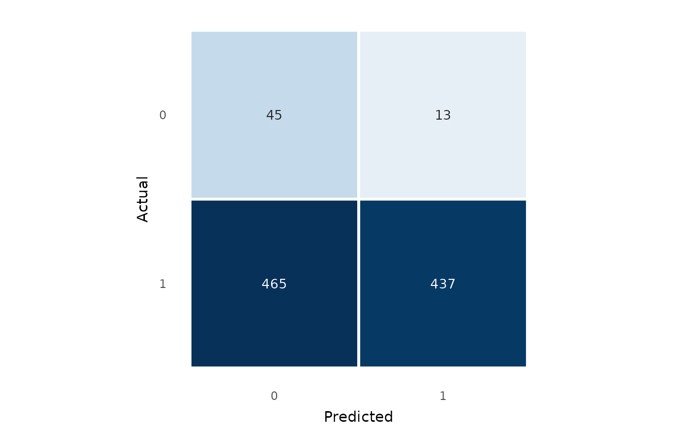
Cross-tabulates predicted against actual classes and displays the counts as a
heatmap. The input can be a fitted binomial glm (with a probability
threshold) or a pair of vectors of actual and predicted classes. Each count
is drawn in black or white, whichever has the higher contrast against its
cell.
Usage
confusion_matrix_plot(
  x,
  predicted = NULL,
  threshold = 0.5,
  normalise = c("none", "row", "col"),
  title = NULL
)
Arguments
- x
A binomial
glm, or the vector of actual classes.- predicted
When
xis an actual-class vector, the matching predicted classes.- threshold
When
xis aglm, the probability threshold for the positive class. As well as a number in[0, 1], you may pass the string"youden"to reuse the Youden's J optimal threshold (the same operating pointroc_curve_plot()marks), so the confusion matrix and the ROC curve agree on the cut-off.- normalise
One of
"none","row"(by actual class) or"col"(by predicted class); controls the fill shading and the cell annotation.- title
Plot title.
Value
A ggplot2::ggplot object. The threshold actually used is stored in
attr(plot, "threshold").
Examples
gfit <- glm(accuracy ~ word_frequency + RT + condition,
data = lexical_decision, family = binomial)
confusion_matrix_plot(gfit, threshold = 0.5)
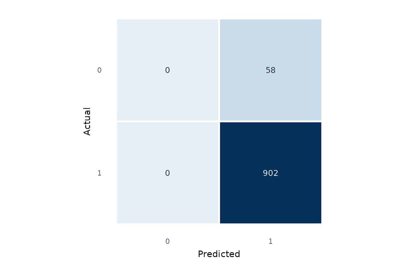 # Reuse the Youden-optimal operating point.
confusion_matrix_plot(gfit, threshold = "youden")
# Reuse the Youden-optimal operating point.
confusion_matrix_plot(gfit, threshold = "youden")