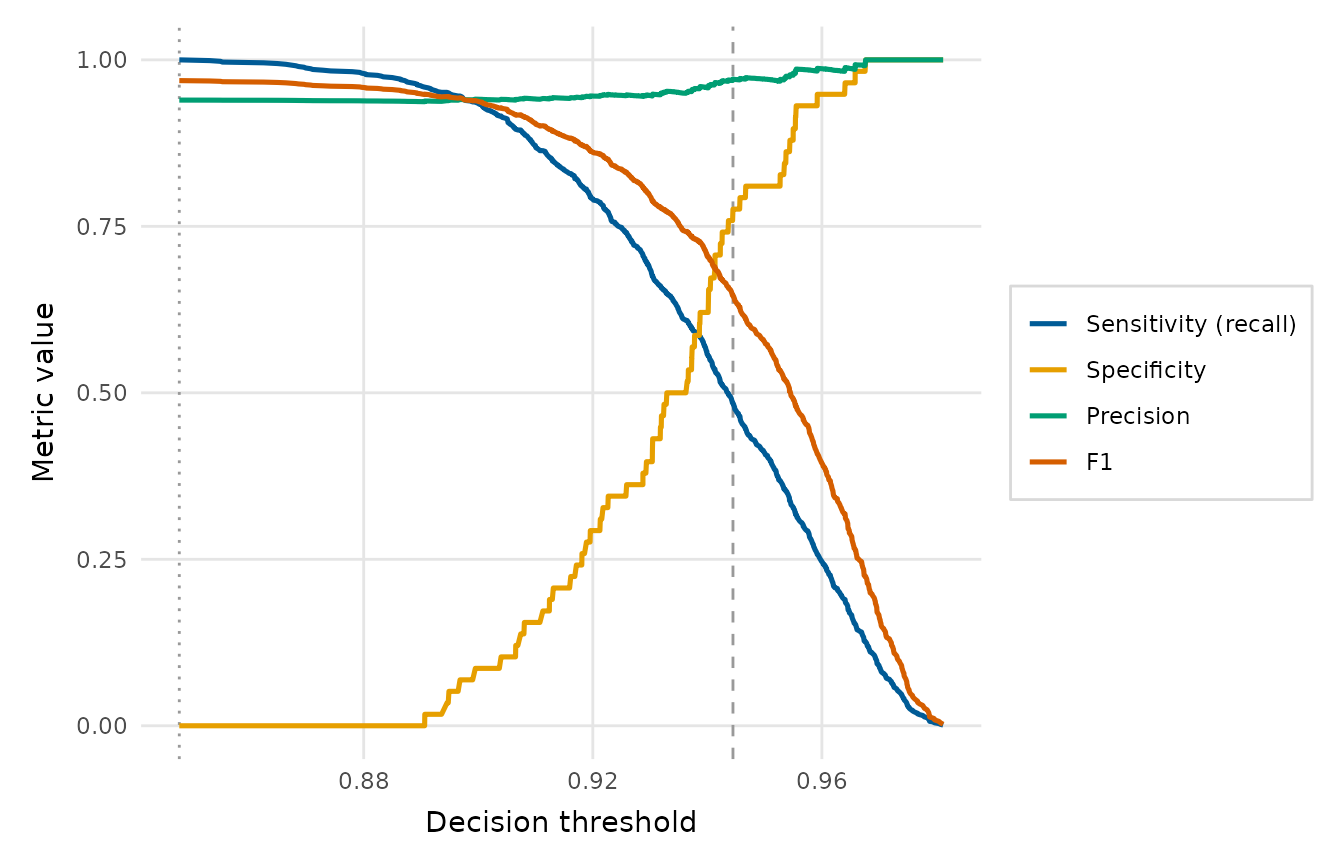
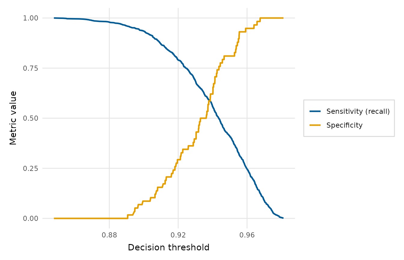
Sweeps the decision threshold across the full range of scores and plots the chosen classification metrics - any of sensitivity (= recall), specificity, precision and F1 - as colour-coded curves. This is the natural companion to the ROC and precision-recall curves for choosing an operating point: it shows directly how each metric trades off as the cut-off moves, and (by default) marks the Youden's J and maximum-F1 optimal thresholds.
Arguments
- x
A binomial
glm, or the vector of observed outcomes (0/1, logical or a two-level factor with the positive class second).- score
When
xis an outcome vector, the matching scores or predicted probabilities.- metrics
Which metrics to draw: any subset of
"sensitivity","specificity","precision"and"f1". ("recall"is accepted as an alias for"sensitivity".)- mark
Which optimal operating points to mark with a dashed vertical line: any subset of
"youden"(max sensitivity + specificity - 1) and"f1"(max F1). Usecharacter(0)orNULLto mark none.- title
Plot title.
Value
A ggplot2::ggplot object. The Youden and max-F1 thresholds are
stored in attr(plot, "thresholds").
Details
At threshold \(t\) a case is predicted positive when its score is \(\ge t\). The metrics are evaluated at every distinct score (the points at which the confusion matrix can change), so the curves are exact step functions rather than a coarse grid. Between two adjacent scores, each metric keeps its value at the upper one, so each step changes at a score and runs flat below it.