
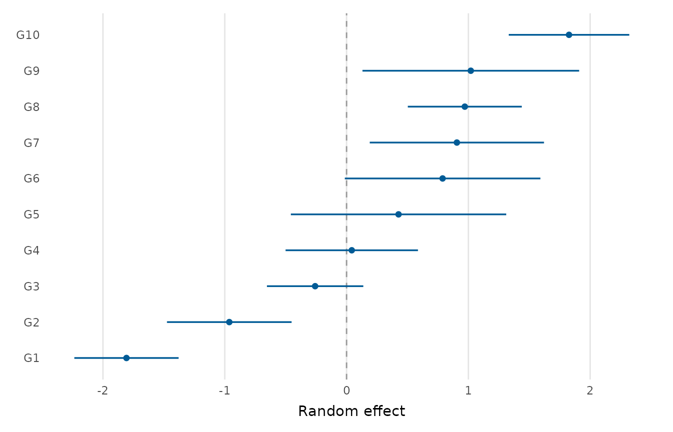
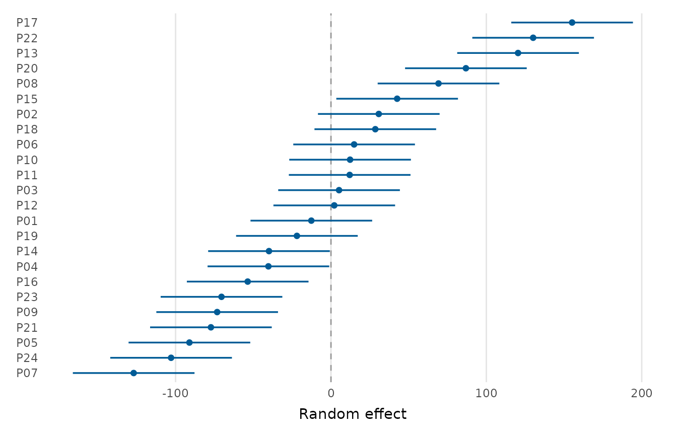
Displays the conditional modes ("BLUPs") of a mixed model's random effects as a sorted point-and-interval ("caterpillar") plot. It is the usual way to inspect by-group departures from the average, and to identify unusual groups.
Usage
random_effects_plot(
  x,
  conf_level = 0.95,
  sort = TRUE,
  point_colour = depictr_brand(),
  title = NULL,
  x_lab = "Random effect"
)
Arguments
- x
Either a mixed model fitted with 'lme4' (
merMod), or a data frame with one row per group level and columns such aslevel/group,estimate, and eitherconf.low/conf.highorstd.error. An optionaltermcolumn facets the plot. A model may have several grouping factors and several terms per factor, correlated or not. The forms(1 + x | g),(1 + x || g)and(1 | g) + (0 + x | g)are all drawn. The intervals are the conditional modes plus or minus the normal quantile times the conditional standard deviations thatlme4::ranef(condVar = TRUE)reports. A model with one term in all is drawn in a single panel labelled "Random effect", and otherwise each term has a panel labelled "factor: term".- conf_level
Confidence level when intervals are derived from standard errors, a single number strictly between 0 and 1.
- sort
Whether to order the levels by their estimate.
- point_colour
Colour for the points and intervals.
- title, x_lab
Plot title and value-axis label.
Value
A ggplot2::ggplot object.
Examples
# From a data frame of by-group estimates:
re <- data.frame(
level = paste0("G", 1:10),
estimate = sort(rnorm(10)),
std.error = runif(10, 0.2, 0.5)
)
random_effects_plot(re)
 # \donttest{
if (requireNamespace("lme4", quietly = TRUE)) {
m <- lme4::lmer(RT ~ condition + (1 | participant), data = lexical_decision)
random_effects_plot(m)
}
# \donttest{
if (requireNamespace("lme4", quietly = TRUE)) {
m <- lme4::lmer(RT ~ condition + (1 | participant), data = lexical_decision)
random_effects_plot(m)
}
 # }
# }