Draws statistical power against sample size, with a dashed line at a target
power (80% by default). The input is usually a power curve produced by
simr::powerCurve(), though a tidy data frame works equally well, allowing
the plot to be redrawn without repeating a power simulation that is often
slow to run.
Usage
power_curve_plot(
  x,
  target = 0.8,
  x_lab = "Sample size",
  x_breaks = NULL,
  x_expand = NULL,
  ribbon = TRUE,
  title = NULL,
  interaction = c("times", "asterisk", "colon", "space"),
  n = NULL,
  power = NULL,
  group = NULL,
  lower = NULL,
  upper = NULL,
  y_lab = NULL,
  solved = NULL
)
Arguments
- x
A
powerCurveobject from 'simr', or a data frame with a sample size column (n,nlevels,x,sample_sizeorn_subject), a power column (power,meanorp), and optional confidence limits (<power>_lo/<power>_hi,lower/upper,ci_low/ci_highorconf.low/conf.high).- target
Target power, drawn as a horizontal reference line. Use
NAto omit it.- x_lab
X-axis label.
- x_breaks
Approximate number of x-axis breaks.
- x_expand
Optional value(s) to extend the x-axis to.
- ribbon
Whether to draw the confidence band as a shaded ribbon (
TRUE) or as error bars (FALSE).- title
Plot title. If
NULLandxis a 'simr' power curve, the predictor name stored in the object is used.- interaction
Passed to
format_terms()when deriving the title from a 'simr' object.- n, power
Columns holding the sample size and the power, as strings or unquoted names. By default, they are found among the names listed under
x.powermay name any proportion on the 0-1 scale, such as pilotr'sp_meaningful.- group
Column that separates several curves, as a string or an unquoted name. Each level is drawn as its own line, in its own colour and line type. By default, an
effect,paramortermcolumn with more than one level is used, with a message. Rows that share a sample size with no such column are an error, because joining them would draw a zigzag.- lower, upper
Columns holding the lower and upper confidence limits. Name both or neither. By default, they are found among the names listed under
x.- y_lab
Y-axis label. By default, "Power" when the power column is one of the names listed under
x, and the column's name otherwise.- solved
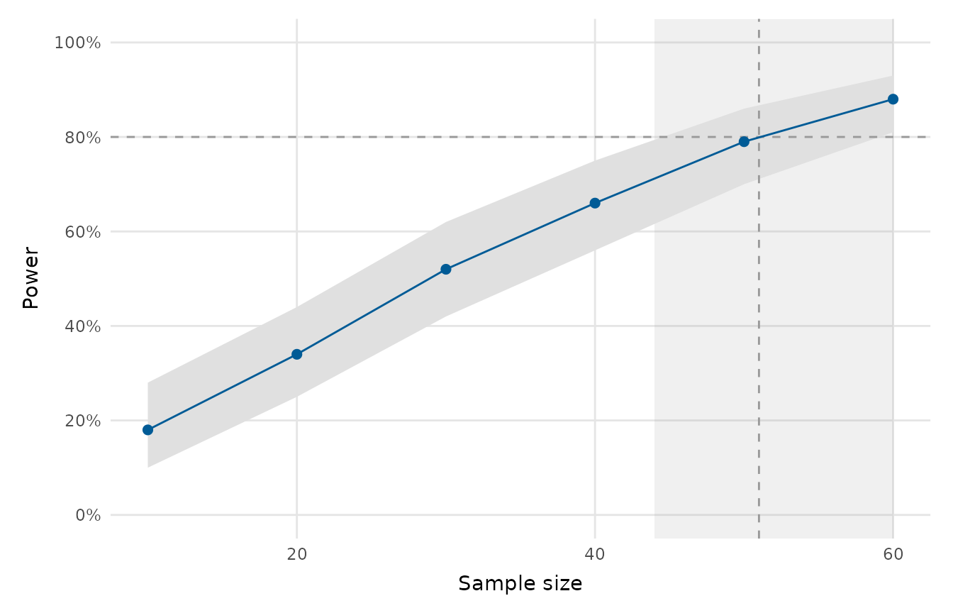
A sample size solved from the curve, with its confidence interval: a list with numeric
value,loandhi, as pilotr'starget_n()andsolve_curve()return, or a one-row data frame with the same columns. Other fields are ignored. The solved value is drawn as a dashed vertical line and its interval as a grey band behind the curve. An interval that reaches past the swept sizes widens the x-axis to show it.
Value
A ggplot2::ggplot object.
Details
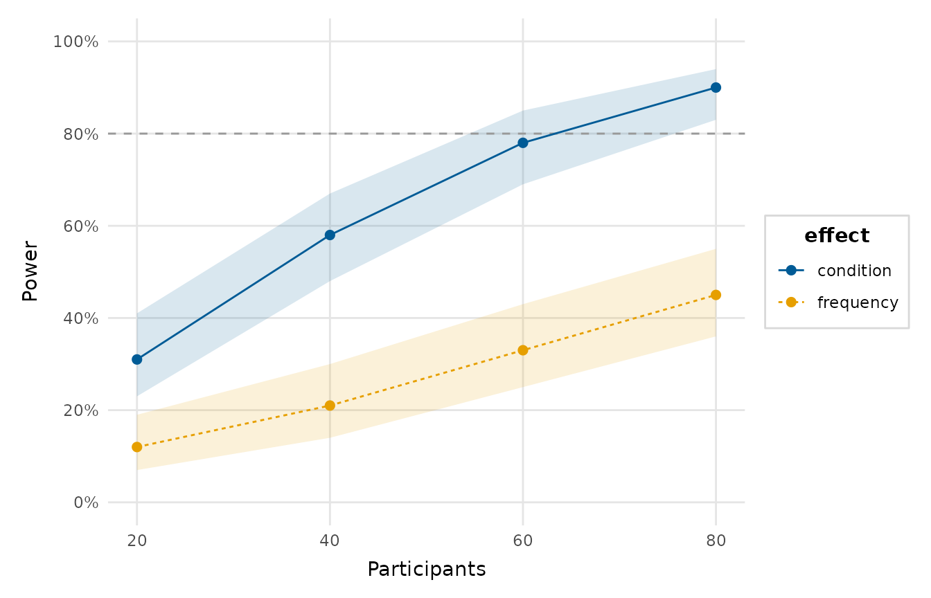
A table may hold several curves, one per effect or design, stacked by row.
Each is drawn as its own line, told apart by colour and line type. The
tables pilotr returns are read as they are: power_curve_mixed() gives
n_subject, effect, power, power_lo and power_hi, and
precision_curve() gives n_subject, param and the decision
probabilities p_meaningful and p_equivalent with their own _lo and
_hi bounds, which power can name. The sample size that pilotr's
target_n() solves from such a curve, and its interval, can be marked on
the plot with solved.
Examples
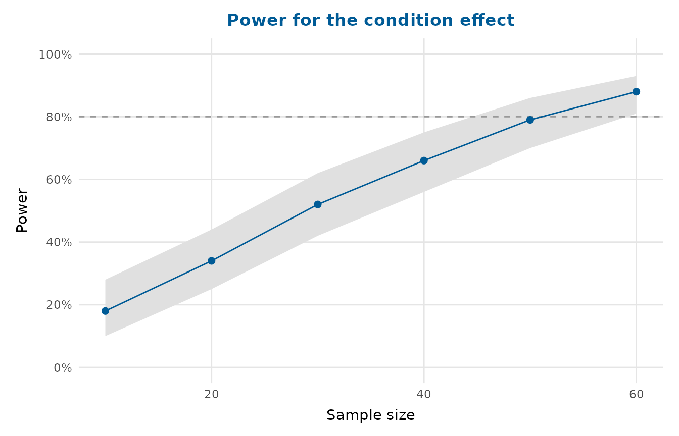
pc <- data.frame(
nlevels = c(10, 20, 30, 40, 50, 60),
mean = c(0.18, 0.34, 0.52, 0.66, 0.79, 0.88),
lower = c(0.10, 0.25, 0.42, 0.56, 0.70, 0.81),
upper = c(0.28, 0.44, 0.62, 0.75, 0.86, 0.93)
)
power_curve_plot(pc, title = "Power for the condition effect")
 # Two curves in one table, laid out as pilotr's power_curve_mixed() returns
# them: one row per sample size and effect.
curves <- data.frame(
n_subject = rep(c(20, 40, 60, 80), each = 2),
effect = rep(c("condition", "frequency"), times = 4),
power = c(0.31, 0.12, 0.58, 0.21, 0.78, 0.33, 0.90, 0.45),
power_lo = c(0.23, 0.07, 0.48, 0.14, 0.69, 0.25, 0.83, 0.36),
power_hi = c(0.41, 0.19, 0.67, 0.30, 0.85, 0.43, 0.94, 0.55)
)
power_curve_plot(curves, group = "effect", x_lab = "Participants")
# Two curves in one table, laid out as pilotr's power_curve_mixed() returns
# them: one row per sample size and effect.
curves <- data.frame(
n_subject = rep(c(20, 40, 60, 80), each = 2),
effect = rep(c("condition", "frequency"), times = 4),
power = c(0.31, 0.12, 0.58, 0.21, 0.78, 0.33, 0.90, 0.45),
power_lo = c(0.23, 0.07, 0.48, 0.14, 0.69, 0.25, 0.83, 0.36),
power_hi = c(0.41, 0.19, 0.67, 0.30, 0.85, 0.43, 0.94, 0.55)
)
power_curve_plot(curves, group = "effect", x_lab = "Participants")
 # The sample size at which pc reaches 80% power, with its interval, in the
# form pilotr's target_n() returns. The values here are illustrative.
power_curve_plot(pc, solved = list(value = 51, lo = 44, hi = 60))
# The sample size at which pc reaches 80% power, with its interval, in the
# form pilotr's target_n() returns. The values here are illustrative.
power_curve_plot(pc, solved = list(value = 51, lo = 44, hi = 60))