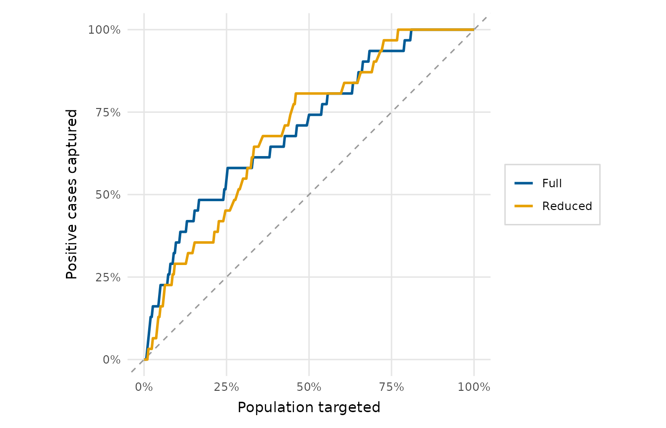
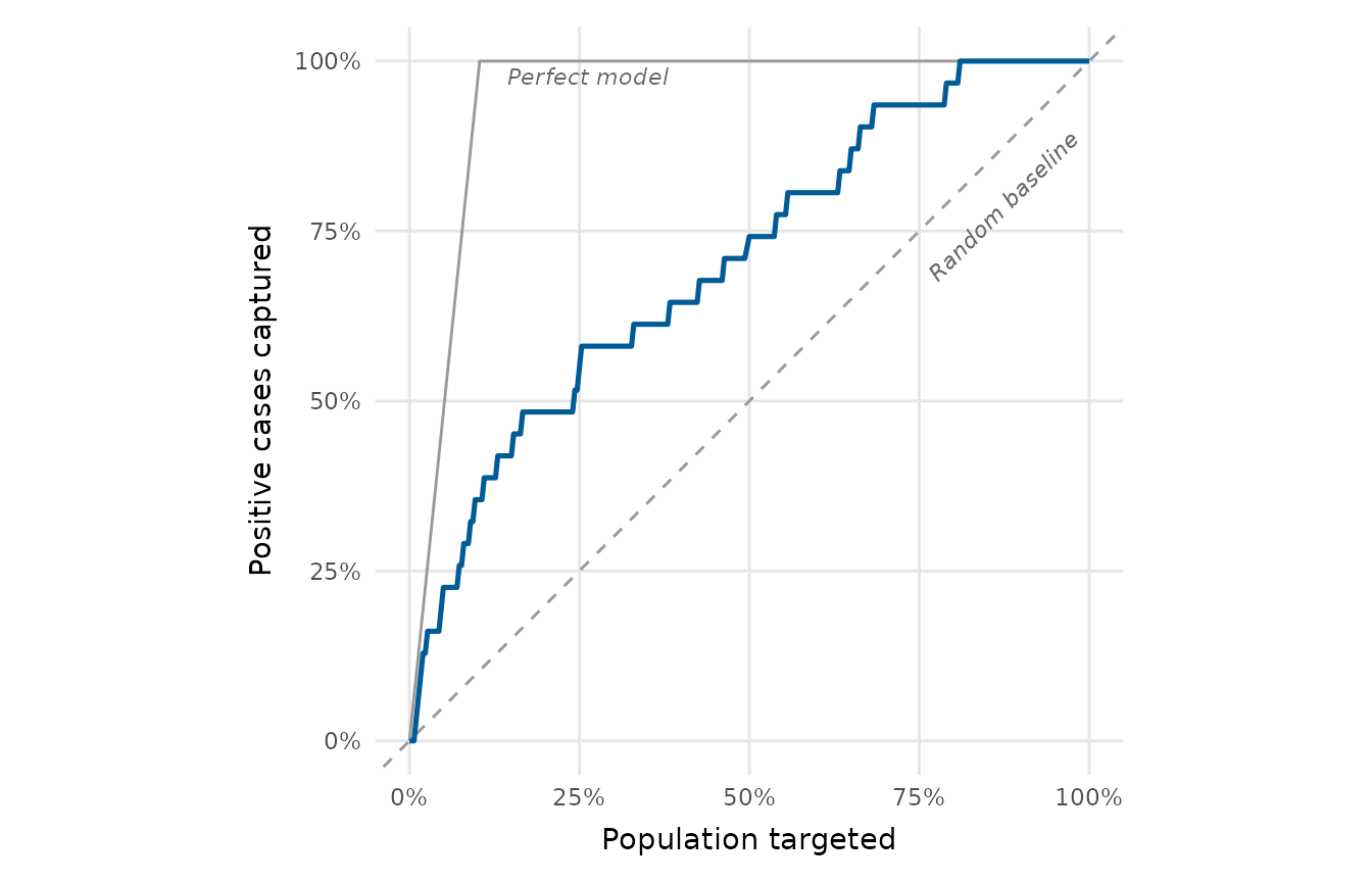
Shows how many of the positive cases are captured as a growing share of the population is targeted in order of predicted score. It is the customary chart for judging a classifier's value for ranking and targeting, as in marketing, triage and fraud detection. The diagonal marks the no-model baseline, and a second reference line marks a perfect model. Pass a named list of models / (actual, score) pairs to overlay several colour-coded gains curves with a legend. The perfect-model line is then omitted, since it depends on the prevalence of the outcome and the overlaid models need not share one.
Arguments
- x
A binomial
glm; the vector of observed outcomes (0/1, logical or a two-level factor with the positive class second); or a named list of models / (actual, score) pairs to overlay.- score
When
xis an outcome vector, the matching scores or predicted probabilities (or a list of them for the multi-model case).- colour
Curve colour for the single-model case. Defaults to the depictr brand blue. Ignored when several models are overlaid.
- legend_inside
When
TRUE(and several models are overlaid), draw the legend inside the panel (in the bottom-right triangle the concave curve leaves empty) over a translucent background, instead of in a right-hand margin. Defaults toFALSE.- title
Plot title.
Value
A ggplot2::ggplot object.
Examples
# Targeting only pays off when the positive class is scarce, so the example
# uses the rare clinical-trial adverse event (about 10% positive).
gfit <- glm(adverse_event ~ biomarker + age + arm,
data = clinical_trial, family = binomial)
gain_plot(gfit)
 # Compare two models.
reduced <- glm(adverse_event ~ biomarker, data = clinical_trial,
family = binomial)
gain_plot(list(Full = gfit, Reduced = reduced))
# Compare two models.
reduced <- glm(adverse_event ~ biomarker, data = clinical_trial,
family = binomial)
gain_plot(list(Full = gfit, Reduced = reduced))