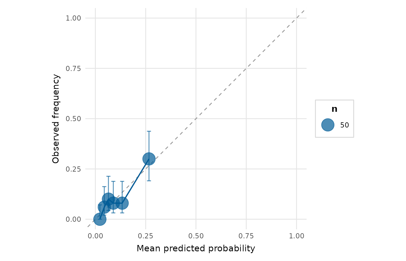
Assesses how well predicted probabilities match observed frequencies. The scores are split into bins; for each bin the mean predicted probability is plotted against the observed event rate, with the diagonal marking perfect calibration. A Wilson binomial confidence interval is drawn on each bin's observed proportion so that bins backed by few observations are not over-interpreted. Pass a named list of models / (actual, score) pairs to overlay several colour-coded calibration curves with a legend.
Usage
calibration_plot(
  x,
  score = NULL,
  bins = 10,
  colour = depictr_brand(),
  conf_level = 0.95,
  title = NULL
)
Arguments
- x
A binomial
glm, the vector of observed outcomes, or a named list of models / (actual, score) pairs to overlay.- score
When
xis an outcome vector, the matching predicted probabilities (or a list of them for the multi-model case).- bins
Number of (equal-count) bins.
- colour
Point/line colour for the single-model case. Defaults to the depictr brand blue. Ignored when several models are overlaid.
- conf_level
Confidence level for the per-bin Wilson interval on the observed proportion, a single number strictly between 0 and 1. Use
NAto omit the intervals. Intervals are only drawn in the single-model case to keep the overlay legible.- title
Plot title.
Value
A ggplot2::ggplot object.
Examples
# Calibration is judged against the base rate, so the example uses the rare
# clinical-trial adverse event (about 10% positive).
gfit <- glm(adverse_event ~ biomarker + age + arm,
            data = clinical_trial, family = binomial)
calibration_plot(gfit, bins = 6)