Note
Go to the end to download the full example code.
Classification and survival#
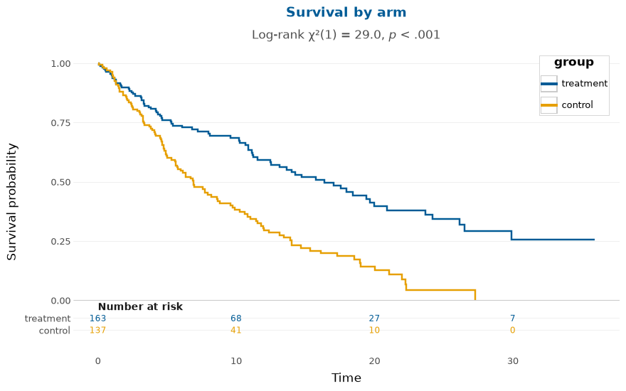
The classification metrics come from scikit-learn and the survival estimate from lifelines; depictr redraws both under the shared theme. The survival figure adds a number-at-risk table beneath the curves in one call.
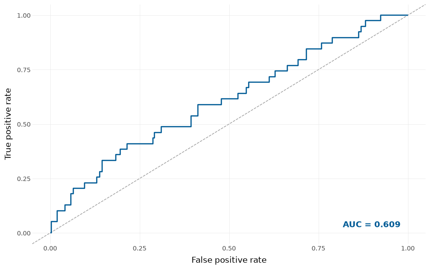
An ROC curve with the area under the curve.
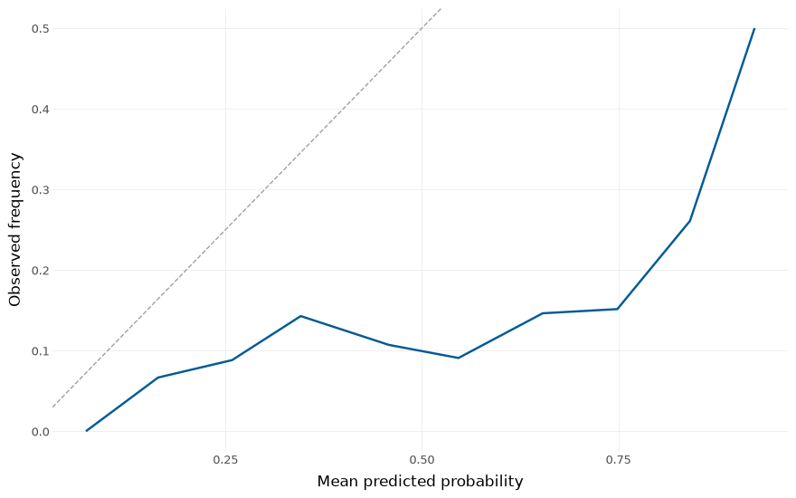
A calibration (reliability) curve.
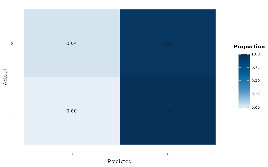
A confusion-matrix heatmap, normalised by the true class.
Kaplan-Meier curves with a log-rank test and a number-at-risk table. The legend sits in the empty top-right the descending curves leave behind.
Total running time of the script: (0 minutes 0.719 seconds)