Greenhouse gas emissions in context: Raw totals, income groups and human development
Everything happens in a context that determines, at least in part, the possibilities and the freedom of those involved. The global warming crisis is likewise subject to circumstances. Countries all around the world are under pressure to abandon fossil fuels as quickly as possible in favour of renewable energy. This is a healthy and necessary switch, but it is not free. Replacing coal and oil with solar and wind energy is so expensive that countries have to approach such shifts with caution, to avoid laying off thousands of workers as industrial production decreases. The question, therefore, cannot be limited to who pollutes most. The socioeconomic conditions of each country must be considered too, although many of the details escape the general public, as a video report by the Guardian illustrates.
Greenhouse gases are the main driver of global warming, and their emissions are monitored in the Emissions Database for Global Atmospheric Research (EDGAR), published by the European Commission (Crippa et al., 2025). As is often the case, the database reports raw figures, whether per country, per region or per capita. Raw figures are necessary but not sufficient, as they neglect the circumstances of each country. Can India convert its energy production system as fast as the United States? Barack Obama addressed this question in reference to the Paris Agreement in an interview: ‘Look, I understand you can’t leave half a billion people in poverty. […] If I don’t see their perspective, then, not only am I not going to get their cooperation, I’m not going to solve the problem that’s in my interest to solve.’
Socioeconomic status is one covariate to consider alongside raw emission statistics. The figures below move from raw totals to per-capita emissions by income group, and then to emissions read against human development. The original version of this analysis, prepared as a data-visualisation task and kept as a PDF in the companion repository, weighted emissions by a commercial ‘standard of living’ score from a country-ranking website. The finished version uses the Human Development Index (HDI) of the United Nations Development Programme (2025), an official and documented composite of health, education and income.
Data and preparation
All emissions come from the 2025 EDGAR booklet (Crippa et al., 2025), which runs from 1970 to 2024. Greenhouse gas (GHG) here covers fossil CO2, CH4, N2O and fluorinated gases, aggregated with the 100-year global warming potentials of the IPCC Fifth Assessment Report, and excludes land use, land-use change and forestry. The booklet reports totals in million tonnes of CO2 equivalent per year (Mt CO2eq) and per-capita emissions in tonnes per person, and it includes the EU27 and the world as rows of their own, whose totals are used as reported. The world population and the world per-capita figure are recomputed from the territories instead, which puts the latter slightly below EDGAR’s own, because international aviation and shipping leave the numerator but their share of the population does not.
This post reads three compact files that were derived from the booklet and from three context sources in the companion repository, where the document that builds them from the original workbooks also lives. ghg_long.csv holds one row per territory and year with its continent, income group, total, per-capita figure, derived population and euro-area membership. hdi_2023.csv holds the Human Development Index for 2023 from the 2025 Human Development Report (United Nations Development Programme, 2025). sectors_2024.csv holds the 2024 emissions of each territory by EDGAR sector, summed over the four substances. Continents come from the ISO 3166 dataset maintained by Duncalfe (n.d.) and income groups from the World Bank classification for fiscal year 2026 (World Bank, 2025).
The population of each territory and year is the total divided by the per-capita figure, which recovers the population series behind EDGAR’s own per-capita values without a further source. EDGAR reports Serbia and Montenegro (code SCG) and Sudan and South Sudan (code SDN) as combined territories. It likewise folds Liechtenstein into Switzerland, Andorra into Spain, Monaco into France, San Marino and the Holy See into Italy, and the State of Palestine into Israel. These rows are kept exactly as reported and are later compared with the HDI of the member whose code they carry, except Serbia and Montenegro, whose code belongs to neither member and is matched to Serbia by hand. The first chunk loads the packages, sets one theme for all static figures and fixes the colours, taken from the Okabe-Ito palette, that each continent and income group keeps throughout.
library(dplyr)
library(tidyr)
library(ggplot2)
library(patchwork)
library(scales)
library(ggrepel)
library(ggtext)
library(plotly)
library(htmltools)
library(leaflet)
library(sf)
library(rnaturalearth)
library(RColorBrewer)
library(knitr)

theme_set(theme_minimal(base_size = 13))
theme_update(
  # Set the leaf elements, not the axis.title parent: under ggplot2 4.0 the parent no
  # longer propagates the element_markdown class down to axis.title.x/axis.title.y, so
  # the axes print a literal "CO<sub>2</sub>" instead of a subscript
  axis.title.x = element_markdown(),
  axis.title.y = element_markdown(angle = 90),
  plot.title = element_text(size = 13, face = 'bold'),
  plot.title.position = 'plot',
  # element_textbox_simple wraps at the width of the figure; element_markdown
  # would run the caption off the right edge of a wide plot
  plot.caption = element_textbox_simple(hjust = 0, colour = 'grey30', size = 10,
                                        lineheight = 1.25, width = unit(1, 'npc'),
                                        margin = margin(t = 10)),
  plot.caption.position = 'plot',
  panel.grid.minor = element_blank(),
  legend.position = 'bottom'
)

continent_colours <- c(Asia = '#D55E00', America = '#0072B2', Europe = '#009E73',
                       Africa = '#E69F00', Oceania = '#CC79A7',
                       `International transport` = '#56B4E9')
income_colours <- c(`High income` = '#D55E00', `Upper middle income` = '#E69F00',
                    `Lower middle income` = '#0072B2', `Low income` = '#009E73')

fmt <- function(x, digits = 0) formatC(x, format = 'f', digits = digits, big.mark = ',')
pct <- function(x, digits = 1) paste0(fmt(x, digits), '%')
ordinal <- label_ordinal()
edgar_caption <- 'Source: EDGAR 2025 (Crippa et al., 2025).'
caption_theme <- theme(
  plot.caption = element_textbox_simple(hjust = 0, colour = 'grey30', size = 10,
                                        lineheight = 1.25, width = unit(1, 'npc'),
                                        margin = margin(t = 10)))
The next chunk reads the three files, separates EDGAR’s own EU27 and world rows from the territories, and lists the joint territories so that later sections can match them to the right HDI.
ghg <- read.csv('data/ghg_long.csv', stringsAsFactors = FALSE)
hdi <- read.csv('data/hdi_2023.csv', stringsAsFactors = FALSE)
sectors_2024 <- read.csv('data/sectors_2024.csv', stringsAsFactors = FALSE)

world <- ghg %>% filter(iso3 == 'GLOBAL TOTAL') %>% select(year, world_mt = total_mt)
eu27 <- ghg %>% filter(iso3 == 'EU27') %>% select(year, eu27_mt = total_mt)
world_2024 <- world$world_mt[world$year == 2024]

# Countries, plus international aviation (AIR) and shipping (SEA)
countries <- ghg %>% filter(!iso3 %in% c('EU27', 'GLOBAL TOTAL'))

# Territories that EDGAR reports jointly under one code, with their members
combined <- tribble(
  ~iso3, ~member_iso3, ~member,
  'SCG', 'SRB', 'Serbia',       'SCG', 'MNE', 'Montenegro',
  'SDN', 'SDN', 'Sudan',        'SDN', 'SSD', 'South Sudan',
  'ISR', 'ISR', 'Israel',       'ISR', 'PSE', 'State of Palestine',
  'CHE', 'CHE', 'Switzerland',  'CHE', 'LIE', 'Liechtenstein',
  'ESP', 'ESP', 'Spain',        'ESP', 'AND', 'Andorra',
  'FRA', 'FRA', 'France',       'FRA', 'MCO', 'Monaco',
  'ITA', 'ITA', 'Italy',        'ITA', 'SMR', 'San Marino', 'ITA', 'VAT', 'Holy See'
)

# A row without a continent would otherwise vanish silently from figure 1
stopifnot(!anyNA(countries$continent))
c(territories = n_distinct(countries$iso3), years = n_distinct(ghg$year),
  countries_with_hdi = nrow(hdi), sector_rows = nrow(sectors_2024))
#> territories years countries_with_hdi sector_rows
#> 210 55 195 1675World and regional totals
Figure 1 shows the world total by continent since 1970, with international aviation and shipping kept as a category of their own because EDGAR attributes them to no country, and, below it, the emissions of the EU27 and of the euro area as a percentage of the world total. The second panel is where the trajectory of European emissions becomes visible, since on the scale of the world total the European series are too small to read.
by_continent <- countries %>%
  group_by(continent, year) %>%
  summarise(total_mt = sum(total_mt), .groups = 'drop')

continent_order <- by_continent %>%
  filter(year == 2024) %>%
  arrange(desc(total_mt)) %>%
  pull(continent)

by_continent <- by_continent %>%
  mutate(continent = factor(continent, levels = continent_order))

continent_share <- function(cont, yr) {
  100 * by_continent$total_mt[by_continent$continent == cont & by_continent$year == yr] /
    world$world_mt[world$year == yr]
}

p1a <- ggplot(by_continent, aes(year, total_mt, fill = continent)) +
  geom_area(position = position_stack(reverse = TRUE), colour = 'white', linewidth = 0.3) +
  scale_fill_manual(values = continent_colours, guide = guide_legend(reverse = TRUE)) +
  scale_x_continuous(breaks = seq(1970, 2020, 10), expand = c(0, 0)) +
  scale_y_continuous(labels = comma, expand = expansion(mult = c(0, 0.04))) +
  labs(title = 'a. World total by continent',
       x = NULL, y = 'Mt CO<sub>2</sub>eq per year', fill = NULL) +
  theme(legend.position = 'right')

# Shares of the world total: EU27 from EDGAR's own row, euro area summed over members
shares <- world %>%
  left_join(eu27, by = 'year') %>%
  left_join(countries %>%
              filter(euro_area) %>%
              group_by(year) %>%
              summarise(euro_area_mt = sum(total_mt), .groups = 'drop'),
            by = 'year') %>%
  mutate(EU27 = 100 * eu27_mt / world_mt,
         `Euro area` = 100 * euro_area_mt / world_mt)

eu27_peak_year <- shares$year[which.max(shares$eu27_mt)]
eu27_peak_mt <- max(shares$eu27_mt)
eu27_value <- function(yr) shares$eu27_mt[shares$year == yr]
share_value <- function(bloc, yr) shares[[bloc]][shares$year == yr]

shares_long <- shares %>%
  select(year, EU27, `Euro area`) %>%
  pivot_longer(-year, names_to = 'bloc', values_to = 'share')

p1b <- ggplot(shares_long, aes(year, share, colour = bloc)) +
  annotate('segment', x = eu27_peak_year, xend = eu27_peak_year, y = 0,
           yend = share_value('EU27', eu27_peak_year), linetype = 'dotted', colour = 'grey40') +
  annotate('text', x = eu27_peak_year + 1, y = 0.8,
           label = paste0('Peak of EU27 emissions in absolute terms:\n',
                          eu27_peak_year, ', ', fmt(eu27_peak_mt), ' Mt'),
           hjust = 0, vjust = 0, size = 3.6, colour = 'grey30', lineheight = 0.95) +
  geom_line(linewidth = 1) +
  geom_text_repel(data = filter(shares_long, year == max(year)),
                  aes(label = paste0(bloc, ', ', fmt(share, 1), '%')),
                  hjust = 0, nudge_x = 1, direction = 'y', segment.colour = NA,
                  size = 4, show.legend = FALSE) +
  scale_colour_manual(values = c(EU27 = '#0072B2', `Euro area` = '#D55E00')) +
  scale_x_continuous(breaks = seq(1970, 2020, 10), expand = expansion(mult = c(0, 0.22))) +
  scale_y_continuous(limits = c(0, NA), labels = function(x) paste0(x, '%'),
                     expand = expansion(mult = c(0, 0.08))) +
  coord_cartesian(clip = 'off') +
  labs(title = 'b. EU27 and euro-area emissions as a share of the world total',
       x = NULL, y = 'Share of the world total') +
  theme(legend.position = 'none')

p1a / p1b +
  plot_layout(heights = c(1.15, 1)) +
  plot_annotation(
    caption = paste0(edgar_caption, ' Units: million tonnes of CO<sub>2</sub> equivalent per year',
                     ' (panel a) and per cent of the world total (panel b).<br>',
                     'EU27: EDGAR\'s own row. Euro area: the sum of its 21 members as of 2026,',
                     ' including Bulgaria.'),
    theme = caption_theme
  )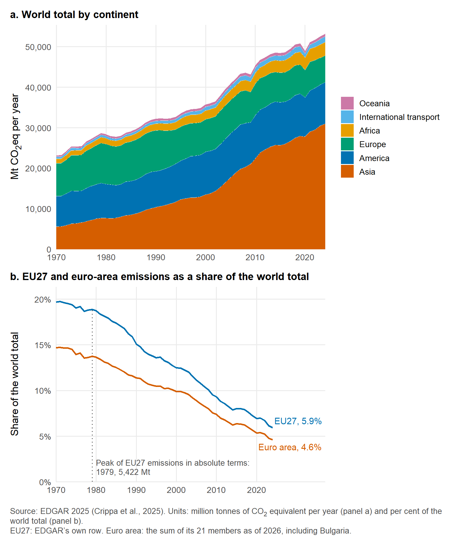
World emissions reached 53,206 Mt CO2eq in 2024, 129% more than in 1970. Asia accounted for 58.2% of the 2024 total, up from 24.1% in 1970, while the share of Europe fell from 34.7% to 12.5% and that of America from 32.5% to 19.2%. International aviation and shipping add 2.6%. The EU27 emitted 3,165 Mt in 2024, 5.9% of the world total against 19.7% in 1970, and the euro area 4.6% against 14.7%. In absolute terms, EU27 emissions peaked in 1979 at 5,422 Mt and stayed within 8% of that peak throughout the 1980s. They have since fallen by 42%, or by 35% relative to 1990, the reference year of most climate targets. Panel (a) cannot show this decline because the world total grew by 85% over the same years.
Income groups
The original version summed per-capita values across the countries of each income group, which produced a number with no interpretation, since per-capita figures cannot be added. The finished version uses the population-weighted mean, the total emissions of the group divided by its population, which is the per-capita emission of the group treated as one territory. Panel (a) of figure 2 shows this quantity for the four World Bank income groups of fiscal year 2026 (World Bank, 2025). Panel (b) shows, for each group, its share of world emissions as a solid line and its share of world population as a dashed line. The distance between the two lines is the gap between what a group emits and what it would emit at the world average.
world_population <- countries %>%
  filter(!is.na(population)) %>%
  group_by(year) %>%
  summarise(world_population = sum(population), .groups = 'drop')

no_income_group <- countries %>%
  filter(year == 2024, !iso3 %in% c('AIR', 'SEA'), is.na(income_group))

by_income <- countries %>%
  filter(!is.na(income_group)) %>%
  group_by(income_group, year) %>%
  summarise(total_mt = sum(total_mt), population = sum(population),
            n_countries = n_distinct(iso3), .groups = 'drop') %>%
  left_join(world, by = 'year') %>%
  left_join(world_population, by = 'year') %>%
  mutate(per_capita_t = total_mt / population * 1e6,
         emission_share = 100 * total_mt / world_mt,
         population_share = 100 * population / world_population,
         income_group = factor(income_group, levels = names(income_colours)))

income_value <- function(group, yr, variable) {
  by_income[[variable]][by_income$income_group == group & by_income$year == yr]
}

p2a <- ggplot(by_income, aes(year, per_capita_t, colour = income_group)) +
  geom_line(linewidth = 1) +
  geom_text_repel(data = filter(by_income, year == max(year)),
                  aes(label = paste0(income_group, ', ', fmt(per_capita_t, 1), ' t')),
                  hjust = 0, nudge_x = 1, direction = 'y', segment.colour = NA,
                  size = 3.8, show.legend = FALSE) +
  scale_colour_manual(values = income_colours) +
  scale_x_continuous(breaks = seq(1970, 2020, 10), expand = expansion(mult = c(0, 0.34))) +
  scale_y_continuous(limits = c(0, NA), expand = expansion(mult = c(0, 0.05))) +
  coord_cartesian(clip = 'off') +
  labs(title = 'a. Population-weighted mean per-capita emissions by World Bank income group',
       x = NULL, y = 't CO<sub>2</sub>eq per person') +
  theme(legend.position = 'none')

shares_by_income <- by_income %>%
  select(income_group, year, emission_share, population_share) %>%
  pivot_longer(c(emission_share, population_share), names_to = 'measure', values_to = 'share') %>%
  mutate(measure = factor(measure, levels = c('emission_share', 'population_share'),
                          labels = c('of emissions', 'of population')))

p2b <- ggplot(shares_by_income, aes(year, share, colour = income_group, linetype = measure)) +
  geom_line(linewidth = 0.9) +
  geom_text_repel(data = filter(shares_by_income, year == max(year)),
                  aes(label = paste0(fmt(share, 0), '% ', measure)),
                  hjust = 0, nudge_x = 1, direction = 'y', segment.colour = NA,
                  size = 3.3, show.legend = FALSE) +
  facet_wrap(~ income_group, nrow = 2) +
  scale_colour_manual(values = income_colours, guide = 'none') +
  scale_linetype_manual(values = c('solid', '22'), guide = 'none') +
  scale_x_continuous(breaks = seq(1970, 2010, 20), expand = expansion(mult = c(0, 0.5))) +
  scale_y_continuous(limits = c(0, NA), labels = function(x) paste0(x, '%'),
                     expand = expansion(mult = c(0, 0.08))) +
  coord_cartesian(clip = 'off') +
  labs(title = 'b. Share of world emissions (solid) and of world population (dashed)',
       x = NULL, y = 'Share of the world total') +
  theme(legend.position = 'none', strip.text = element_text(hjust = 0, face = 'bold'),
        panel.spacing.x = unit(1.5, 'lines'))

p2a / p2b +
  plot_layout(heights = c(1, 1.25)) +
  plot_annotation(
    caption = paste0(edgar_caption, ' Income groups: World Bank (2025), fiscal year 2026.',
                     ' Units: tonnes of CO<sub>2</sub> equivalent per person per year (panel a)',
                     ' and per cent of the world total (panel b).<br>',
                     'Population is the EDGAR total divided by the per-capita figure. ',
                     nrow(no_income_group), ' territories without an income group are omitted.'),
    theme = caption_theme
  )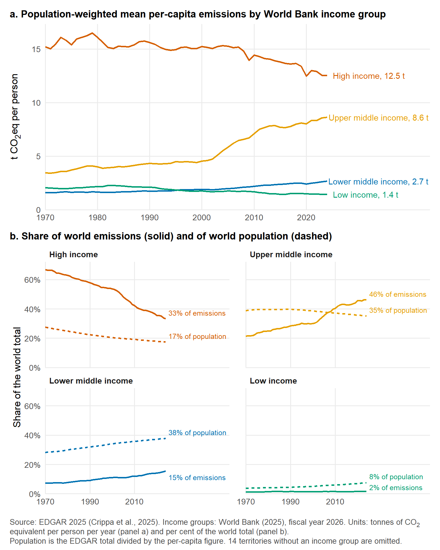
In 2024, a resident of a high-income country emitted 12.5 t on average, 8.8 times the 1.4 t of a resident of a low-income country. The high-income mean peaked at 16.5 t in 1979 and has fallen since. The upper-middle-income mean, for a group that includes China, rose from 4.5 t in 2000 to 8.6 t in 2024, and that group’s share of world emissions overtook the high-income share in 2011. Panel (b) shows the imbalance between people and emissions: high-income countries hold 17.4% of the world’s population and emit 33.3% of the total. The lower-middle-income and low-income groups together hold 45.3% of the population and emit 17.1%. The 14 territories without an income group emitted 0.8% of the 2024 total between them. They include Ethiopia and Venezuela, both left unclassified by the World Bank this year, and small dependencies such as Guadeloupe and the Falkland Islands.
The twenty largest emitters
Figure 3 ranks countries by their 2024 total, coloured by continent, with each country’s share of the world total printed at the end of its bar and its per-capita emissions in a dot plot beside it. The original version drew confidence intervals around these bars, computed as the standard error of a mean across years. Such an interval measures the year-to-year variation of a series and says nothing about the uncertainty of a sum, so it is omitted here.
top20 <- countries %>%
  filter(year == 2024, !iso3 %in% c('AIR', 'SEA')) %>%
  mutate(share = 100 * total_mt / world_2024) %>%
  arrange(desc(total_mt)) %>%
  slice_head(n = 20) %>%
  mutate(country = factor(country, levels = rev(country)))

top_value <- function(code, variable) top20[[variable]][top20$iso3 == code]
# The world total includes international aviation and shipping, whose two rows
# carry no population, so the reference line uses the country total over the
# country population, keeping the numerator and the denominator on the same set.
countries_2024 <- countries %>% filter(year == 2024, !iso3 %in% c('AIR', 'SEA'))
world_per_capita <- sum(countries_2024$total_mt) / sum(countries_2024$population) * 1e6

p3a <- ggplot(top20, aes(total_mt, country, fill = continent)) +
  geom_col(width = 0.72) +
  geom_text(aes(label = pct(share)), hjust = -0.15, size = 3.5, colour = 'grey20') +
  scale_fill_manual(values = continent_colours, breaks = names(continent_colours)) +
  scale_x_continuous(labels = comma, expand = expansion(mult = c(0, 0.16))) +
  labs(title = 'a. Total emissions and share of the world total',
       x = 'Mt CO<sub>2</sub>eq', y = NULL, fill = NULL) +
  theme(panel.grid.major.y = element_blank())

p3b <- ggplot(top20, aes(per_capita_t, country, colour = continent)) +
  geom_vline(xintercept = world_per_capita, linetype = 'dotted', colour = 'grey40') +
  geom_segment(aes(x = 0, xend = per_capita_t, yend = country), colour = 'grey75', linewidth = 0.5) +
  geom_point(size = 3) +
  geom_text(aes(label = fmt(per_capita_t, 1)), hjust = -0.45, size = 3.5, colour = 'grey20') +
  scale_colour_manual(values = continent_colours, guide = 'none') +
  scale_x_continuous(expand = expansion(mult = c(0, 0.28))) +
  labs(title = 'b. Per capita', x = 't CO<sub>2</sub>eq per person', y = NULL) +
  theme(axis.text.y = element_blank(), panel.grid.major.y = element_blank())

p3a + p3b +
  plot_layout(widths = c(2.4, 1), guides = 'collect') +
  plot_annotation(
    caption = paste0(edgar_caption, ' Units: million tonnes of CO<sub>2</sub> equivalent (panel a)',
                     ' and tonnes per person (panel b), both for 2024.<br>',
                     'The dotted line in panel b is the population-weighted world average, ',
                     fmt(world_per_capita, 1), ' t per person.'),
    theme = caption_theme
  ) &
  theme(legend.position = 'bottom')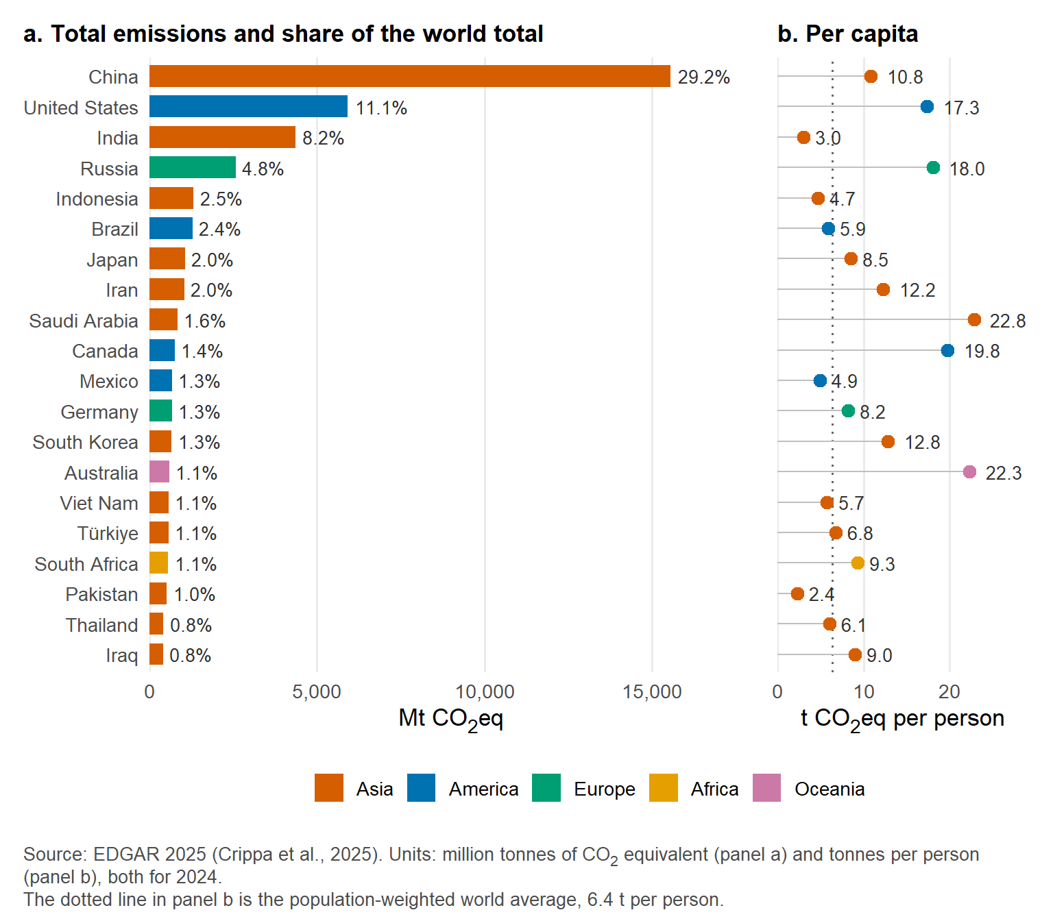
China alone emitted 29.2% of the world total in 2024, the United States 11.1% and India 8.2%, and the twenty countries together account for 76%. Per-capita emissions reorder the list. Saudi Arabia, Australia and Canada, ranked 9th, 14th and 10th by total, emit 22.8, 22.3 and 19.8 t per person, above the 17.3 t of the United States and the 10.8 t of China, while India and Pakistan sit at 3.0 and 2.4 t. The population-weighted world average is 6.4 t per person, and 13 of the twenty countries lie above it.
What the largest emitters emit
Figure 4 breaks the 2024 emissions of the eight largest emitters and of the world down by EDGAR sector, summed over the four substances. This composition was absent from the original version, and it explains part of the per-capita differences above: where power generation and industry dominate, emissions follow the fuel mix of the grid, whereas a large agricultural share reflects livestock and rice paddies, which no change of energy source removes.
sector_order <- sectors_2024 %>%
  filter(iso3 == 'GLOBAL TOTAL') %>%
  arrange(desc(mt)) %>%
  pull(sector)

sector_colours <- setNames(c('#0072B2', '#E69F00', '#D55E00', '#009E73',
                             '#8C5BA8', '#CC79A7', '#56B4E9', '#A08C00'), sector_order)

top8_iso3 <- as.character(top20$iso3[1:8])

sector_shares <- sectors_2024 %>%
  filter(iso3 %in% c(top8_iso3, 'GLOBAL TOTAL')) %>%
  group_by(iso3) %>%
  mutate(share = 100 * mt / sum(mt)) %>%
  ungroup() %>%
  mutate(country = ifelse(iso3 == 'GLOBAL TOTAL', 'World', country),
         country = factor(country, levels = rev(c('World', as.character(top20$country[1:8])))),
         sector = factor(sector, levels = sector_order))

sector_share <- function(code, sec) sector_shares$share[sector_shares$iso3 == code & sector_shares$sector == sec]

largest_sector <- sector_shares %>%
  filter(iso3 != 'GLOBAL TOTAL') %>%
  group_by(country) %>%
  slice_max(share, n = 1) %>%
  ungroup()
# Country names that take the definite article in running prose.
article <- function(x) ifelse(grepl('^(United|Netherlands|Philippines|Gambia)', x), paste('the', x), x)

# The emitters whose largest sector is `sec`, and the share it takes in each,
# so that the name and the percentage in the prose always come from one lookup.
led_by <- function(sec) filter(largest_sector, sector == sec) %>% arrange(desc(share))
countries_led_by <- function(sec)
  paste(article(as.character(led_by(sec)$country)), collapse = ' and ')
share_led_by <- function(sec, digits = 0) paste(pct(led_by(sec)$share, digits), collapse = ' and ')

# Small counts read better as words in prose.
spell <- function(n) {
  words <- c('one', 'two', 'three', 'four', 'five', 'six', 'seven', 'eight', 'nine', 'ten')
  ifelse(n >= 1 & n <= 10, words[pmax(n, 1)], as.character(n))
}

ggplot(sector_shares, aes(share, country, fill = sector)) +
  geom_col(width = 0.72, colour = 'white', linewidth = 0.5, position = position_stack(reverse = TRUE)) +
  # The label layer keeps every row and blanks the small ones, because
  # position_stack() restacks whatever data it is given: filtering the rows out
  # here instead would place each remaining label as though the omitted sectors
  # did not exist.
  geom_text(aes(label = ifelse(share >= 8, round(share), '')),
            position = position_stack(vjust = 0.5, reverse = TRUE), size = 3.3, colour = 'white') +
  scale_fill_manual(values = sector_colours) +
  scale_x_continuous(labels = function(x) paste0(x, '%'), expand = expansion(mult = c(0, 0.02))) +
  guides(fill = guide_legend(nrow = 2, byrow = TRUE)) +
  labs(x = NULL, y = NULL, fill = NULL,
       caption = paste0(edgar_caption, ' Sheet GHG_by_sector_and_country, 2024, summed over substances.<br>',
                        'Units: per cent of each emitter\'s total. Labels are shown for shares of 8% or more.')) +
  theme(panel.grid.major.y = element_blank(), legend.position = 'bottom',
        plot.margin = margin(5.5, 14, 5.5, 5.5))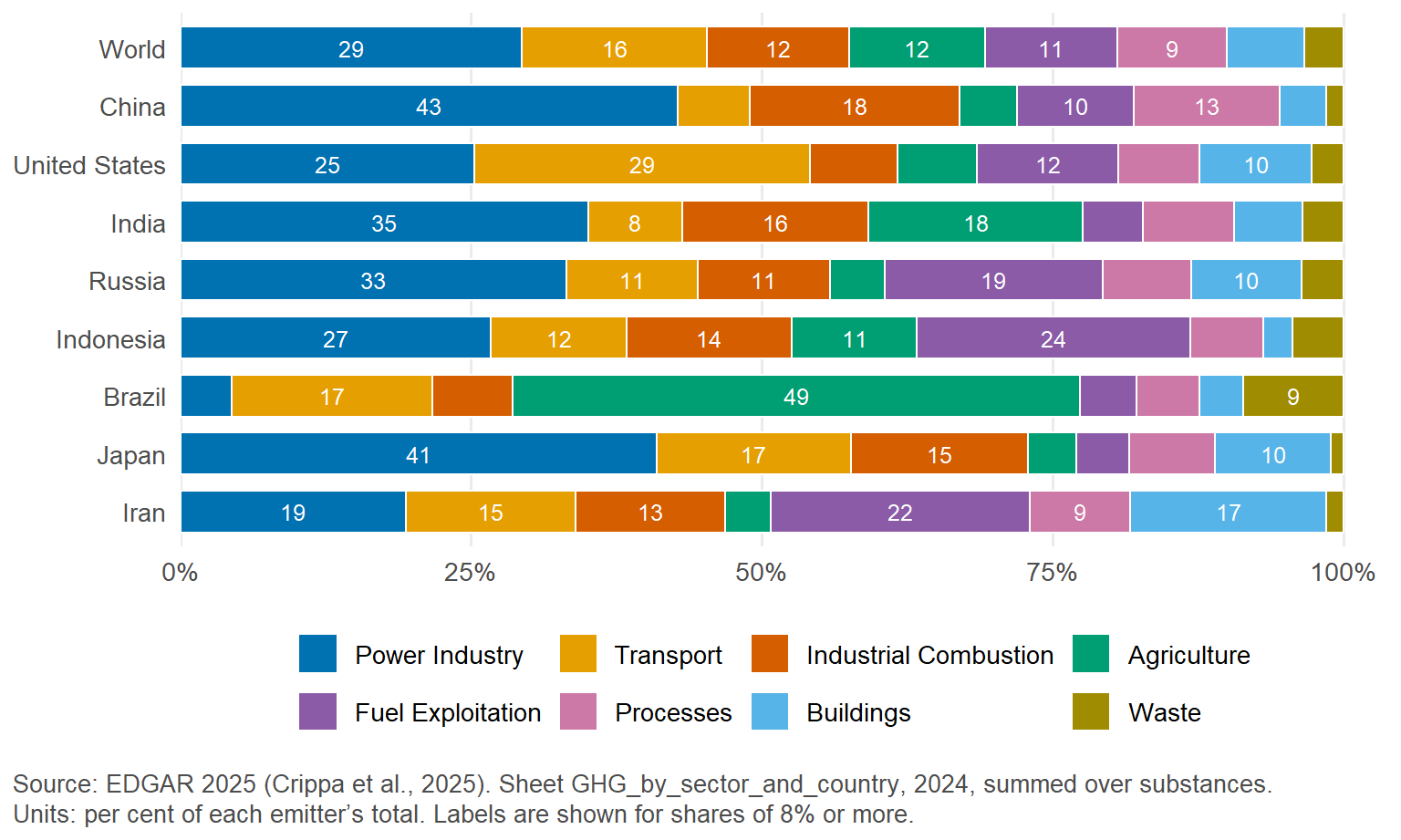
Power generation is the largest sector for the world as a whole, at 29% of emissions, and for five of the eight countries, with the largest shares in China (43%) and Japan (41%). Transport comes first in the United States only, at 29%, and agriculture in Brazil only, at 49%. Fuel exploitation, the extraction and processing of coal, oil and gas, leads in Iran only, at 22%. That last sector also accounts for 24% of Indonesia’s emissions and 19% of Russia’s, against 11% for the world. These compositions matter for the comparison that follows, because methane from livestock and fugitive emissions from fuel extraction do not scale with a country’s development in the way that power and transport do.
Emissions against human development
Per-capita emissions rise with development, and the question that opened this post is how far a country’s emissions depart from what its level of development would lead one to expect. Figure 5 plots per-capita emissions, averaged over 2015 to 2024 to smooth the pandemic dip and year-to-year variation, against the HDI for 2023 on a logarithmic axis, with each marker scaled to the country’s 2024 population and coloured by continent. The chunk below fits the linear model log10(per_capita) ~ hdi, whose line is drawn through the points, and stores each country’s residual from it, the vertical distance to the line in log10 units, which is the quantity carried into figure 6.
hdi_data <- countries %>%
  filter(!iso3 %in% c('AIR', 'SEA'), year >= 2015) %>%
  group_by(iso3, country, continent) %>%
  summarise(per_capita_t = mean(per_capita_t), .groups = 'drop') %>%
  left_join(countries %>% filter(year == 2024) %>% select(iso3, total_mt, population),
            by = 'iso3') %>%
  # Jointly reported territories take the HDI of the member whose code they carry
  mutate(hdi_iso3 = ifelse(iso3 == 'SCG', 'SRB', iso3)) %>%
  left_join(hdi %>% select(hdi_iso3 = iso3, hdi_2023, hdicode), by = 'hdi_iso3')

n_no_hdi <- sum(is.na(hdi_data$hdi_2023))
hdi_data <- hdi_data %>% filter(!is.na(hdi_2023))

hdi_model <- lm(log10(per_capita_t) ~ hdi_2023, data = hdi_data)

hdi_data <- hdi_data %>%
  mutate(fitted = fitted(hdi_model),
         residual = residuals(hdi_model),
         expected_t = 10^fitted,
         ratio = 10^residual)

hdi_slope <- coef(hdi_model)[['hdi_2023']]
hdi_r2 <- summary(hdi_model)$r.squared
hdi_n <- nobs(hdi_model)
ratio_of <- function(code) hdi_data$ratio[hdi_data$iso3 == code]
The model object and the residuals are kept for the map and the table below. The figure itself is a ggplot converted with ggplotly, so hovering over a marker shows the country, its HDI, its per-capita emissions, its 2024 total and its ratio to the fitted line.
fit_line <- tibble(hdi_2023 = seq(min(hdi_data$hdi_2023), max(hdi_data$hdi_2023), length.out = 50)) %>%
  mutate(per_capita_t = 10^predict(hdi_model, newdata = .))

hdi_data <- hdi_data %>%
  mutate(tooltip = paste0('<b>', country, '</b>',
                          '<br>HDI 2023: ', fmt(hdi_2023, 3),
                          '<br>Per capita, 2015 to 2024: ', fmt(per_capita_t, 1), ' t',
                          '<br>Total, 2024: ', fmt(total_mt), ' Mt',
                          '<br>', fmt(ratio, 2), ' times the level expected at its HDI'))

p5 <- ggplot(hdi_data, aes(hdi_2023, per_capita_t)) +
  geom_line(data = fit_line, colour = 'grey40', linewidth = 0.8) +
  geom_point(aes(size = population, colour = continent, text = tooltip), alpha = 0.7) +
  scale_y_log10(labels = comma) +
  scale_size_area(max_size = 20, guide = 'none') +
  scale_colour_manual(values = continent_colours, name = NULL) +
  labs(x = 'Human Development Index, 2023',
       y = 'Per-capita emissions, 2015 to 2024 (t CO<sub>2</sub>eq, log scale)') +
  # A complete theme, so that ggplotly does not merge the ggtext elements of the global theme
  theme_minimal(base_size = 13)

ggplotly(p5, tooltip = 'text') %>%
  layout(legend = list(orientation = 'h', y = -0.18, x = 0.5, xanchor = 'center',
                       itemsizing = 'constant'),
         margin = list(l = 70, r = 20, b = 70, t = 20)) %>%
  # The full plotly bundle is about 3.4 MB, most of it chart types this figure
  # does not use. partial_bundle() substitutes the smallest build that still
  # covers the traces present. It fetches that build from the plotly CDN, so it
  # falls back to the full bundle when the render has no network access.
  lighter_bundle()
Figure 5. Source: EDGAR 2025 (Crippa et al., 2025) and the Human Development Report 2025 (United Nations Development Programme, 2025). Units: tonnes of CO2 equivalent per person per year, averaged over 2015 to 2024. Marker area proportional to 2024 population.
The model is fitted to the 183 countries with both an HDI and emissions. The 25 territories without an HDI are left out: mostly dependencies and overseas territories such as Puerto Rico, Greenland and Macao, plus Taiwan, North Korea and Western Sahara. The slope is 2.12 log10 units per unit of HDI, so each additional 0.1 of HDI multiplies expected per-capita emissions by 1.63. The model explains 58% of the variance in log emissions (R2 = 0.58, n = 183). Of the countries, 78% lie within a factor of two of the line. Qatar and Kuwait emit 6.2 and 5.0 times the level expected at their HDI, Russia 2.5 and the United States 1.7. Sweden and Switzerland, by comparison, emit 0.45 and 0.42 times theirs. China sits at 1.8 and India at 0.85.
The residual is a descriptive contrast between a country and the others at the same HDI, and it is no judgement of fairness. Four caveats apply to any reading of it. The HDI includes gross national income, so it partly encodes the energy use that it is meant to contextualise, and the line therefore absorbs some of the effect of wealth that a reader might want to see. EDGAR is production-based, so the emissions embodied in goods that a country imports are attributed to the exporter, which favours importers of manufactured goods in this comparison and counts against exporters such as China. Land use, land-use change and forestry are excluded, which matters for countries such as Brazil and Indonesia. The model is also a single straight line through 183 points, and small states whose per-capita figure depends on one plant or fleet, oil and gas exporters and pastoral economies pull it in ways that a fuller treatment would handle differently. That fuller treatment, with capability-based fair shares of the remaining carbon budget, is in the manuscript in the companion repository and in the fairshare packages for R and Python that accompany it.
Mapping the residuals
Figure 6 maps the residuals of the model on a diverging scale centred on zero, red where a country emits more than expected at its HDI and blue where it emits less. Hovering shows the residual in log10 units and the ratio 10residual, which is easier to read. Countries without an HDI or without emissions data are shown in light grey, and the members of a territory that EDGAR reports jointly carry the value of that territory, with a note to that effect in the hover text.
# Natural Earth's medium geometry is about 3 MB of coordinates in the widget
# below. Simplifying it would cut that substantially, but every tolerance-based
# method available here damages the map: whole-feature st_simplify() silently
# drops 123 of the 1,620 polygon parts, among them 16 of Kiribati's 19 islands,
# and the per-part variants that keep them leave invalid geometries behind. A
# topology-aware simplifier such as rmapshaper::ms_simplify(keep_shapes = TRUE)
# is the tool for this; until the geometry can be checked under one, the map
# ships at full fidelity.
world_sf <- ne_countries(scale = 'medium', returnclass = 'sf') %>%
  # France and Norway carry -99 as iso_a3 in Natural Earth; iso_a3_eh holds the code
  mutate(iso_a3 = ifelse(iso_a3 == '-99', iso_a3_eh, iso_a3)) %>%
  filter(iso_a3 != 'ATA') %>%
  select(iso_a3, name_long) %>%
  mutate(edgar_iso3 = coalesce(combined$iso3[match(iso_a3, combined$member_iso3)], iso_a3),
         jointly = iso_a3 %in% combined$member_iso3) %>%
  left_join(hdi_data %>% select(iso3, country, hdi_2023, per_capita_t, expected_t, residual, ratio),
            by = c('edgar_iso3' = 'iso3'))

residual_limit <- max(abs(world_sf$residual), na.rm = TRUE)
residual_palette <- colorNumeric(rev(brewer.pal(11, 'RdBu')),
                                 domain = c(-residual_limit, residual_limit),
                                 na.color = '#d9d9d9')

map_labels <- with(world_sf, ifelse(
  is.na(residual),
  paste0('<b>', name_long, '</b><br>no data'),
  paste0('<b>', name_long, '</b>',
         ifelse(jointly, paste0('<br>Reported by EDGAR as ', country), ''),
         '<br>HDI 2023: ', fmt(hdi_2023, 3),
         '<br>Per capita, 2015 to 2024: ', fmt(per_capita_t, 1), ' t (expected ', fmt(expected_t, 1), ' t)',
         '<br>Residual: ', formatC(residual, format = 'f', digits = 2, flag = '+'), ' log10 units',
         '<br>', fmt(ratio, 2), ' times the level expected at its HDI')
# unname(): with() carries the sf row names onto the result, and htmlwidgets
# rejects a partially named list when it scans the widget for JS() markers
)) %>% unname() %>% lapply(HTML)

leaflet(world_sf, width = '100%', height = 520,
        options = leafletOptions(minZoom = 1, maxZoom = 6, worldCopyJump = TRUE)) %>%
  addPolygons(fillColor = ~ residual_palette(residual), fillOpacity = 0.9,
              color = 'white', weight = 0.6, smoothFactor = 0.3,
              label = map_labels,
              highlightOptions = highlightOptions(weight = 2, color = '#333333', bringToFront = TRUE)) %>%
  addLegend(pal = residual_palette, values = c(-residual_limit, residual_limit),
            title = 'Residual (log10)', position = 'bottomleft', opacity = 0.9) %>%
  addLegend(colors = '#d9d9d9', labels = 'no data', position = 'bottomleft', opacity = 0.9) %>%
  setView(lng = 10, lat = 20, zoom = 1) %>%
  htmlwidgets::prependContent(tags$style('.leaflet-container { background: #f4f6f8; }'))
Figure 6. Source: EDGAR 2025 (Crippa et al., 2025), the Human Development Report 2025 (United Nations Development Programme, 2025) and Natural Earth boundaries via rnaturalearth. Units: residual of log10 per-capita emissions (2015 to 2024 mean) from the linear model on HDI 2023. The ratio of actual to expected emissions is 10residual. Boundaries carry no political meaning.
The largest positive residual belongs to Palau, at 11.6 times its expected level, and the largest negative one to Saint Vincent and the Grenadines, at 0.27 times. The table below lists the ten countries at each end. Oil and gas exporters fill most of the positive end, together with small states whose per-capita figure is set by one power plant or one fleet, such as Palau, with 23 thousand inhabitants. Two pastoral economies also appear there. In Mongolia, fuel extraction and livestock account for 73% of emissions, and in Chad agriculture accounts for 90%. Methane from herds enters the total in full, and the model expects little of it at a low HDI, so a country whose emissions are mostly livestock lands above the line. The negative end mixes small island states with countries of South Asia and Sub-Saharan Africa whose emissions are low for their HDI. At the top of the HDI range it also holds Switzerland, reported by EDGAR together with Liechtenstein, whose electricity comes largely from hydropower and nuclear plants. Because EDGAR reports Sudan and South Sudan as one territory, their combined per-capita figure is compared with the HDI of Sudan and mapped onto both countries.
bind_rows(hdi_data %>% slice_max(residual, n = 10),
          hdi_data %>% slice_min(residual, n = 10) %>% arrange(desc(residual))) %>%
  transmute(Country = country, Continent = continent, `HDI 2023` = fmt(hdi_2023, 3),
            `Per capita (t)` = fmt(per_capita_t, 2), `Expected (t)` = fmt(expected_t, 2),
            Ratio = fmt(ratio, 2)) %>%
  kable(align = 'llrrrr',
        caption = paste('The ten countries emitting most above (top) and most below (bottom)',
                        'the level expected at their HDI. Per capita is the 2015 to 2024 mean',
                        'in t CO2eq per person, expected is the fitted value and ratio is',
'actual over expected.'))| Country | Continent | HDI 2023 | Per capita (t) | Expected (t) | Ratio |
|---|---|---|---|---|---|
| Palau | Oceania | 0.786 | 60.73 | 5.23 | 11.61 |
| Qatar | Asia | 0.886 | 52.69 | 8.53 | 6.18 |
| Chad | Africa | 0.416 | 5.00 | 0.86 | 5.84 |
| Mongolia | Asia | 0.747 | 23.21 | 4.32 | 5.37 |
| Kuwait | Asia | 0.852 | 35.97 | 7.22 | 4.98 |
| Trinidad and Tobago | America | 0.807 | 27.38 | 5.80 | 4.72 |
| Bahrain | Asia | 0.899 | 38.15 | 9.09 | 4.20 |
| Turkmenistan | Asia | 0.764 | 19.02 | 4.70 | 4.05 |
| Brunei | Asia | 0.837 | 25.28 | 6.71 | 3.77 |
| Libya | Africa | 0.721 | 12.77 | 3.81 | 3.36 |
| Switzerland and Liechtenstein | Europe | 0.970 | 5.40 | 12.86 | 0.42 |
| Dominica | America | 0.761 | 1.94 | 4.63 | 0.42 |
| Comoros | Africa | 0.603 | 0.89 | 2.14 | 0.42 |
| Democratic Republic of the Congo | Africa | 0.522 | 0.56 | 1.44 | 0.39 |
| Bangladesh | Asia | 0.685 | 1.21 | 3.19 | 0.38 |
| Grenada | America | 0.791 | 1.92 | 5.36 | 0.36 |
| Sri Lanka | Asia | 0.776 | 1.68 | 4.98 | 0.34 |
| Kiribati | Oceania | 0.644 | 0.87 | 2.61 | 0.33 |
| Rwanda | Africa | 0.578 | 0.59 | 1.89 | 0.31 |
| Saint Vincent and the Grenadines | America | 0.798 | 1.52 | 5.55 | 0.27 |
The table shows how different the two ends are in kind. The positive end is dominated by fuel exporters and by pastoral or very small economies. The negative end has no single cause, and ranges from an HDI of 0.52 to 0.97.
How the figures were produced
The EDGAR sheets store years as columns, so each was reshaped to one row per territory and year before the totals and per-capita figures were joined by country code and year, in the companion document that produced the three files read here. Population-weighted means and population shares were computed from the derived population, and the world population is the sum over the territories that report a per-capita figure. Continents, income groups and the HDI were joined by ISO 3166 alpha-3 code. A few exceptions were handled by hand. Taiwan has no region in the ISO 3166 dataset; EDGAR uses the former Netherlands Antilles code for Curaçao and has no row for Kosovo; and the jointly reported territories keep the code under which EDGAR reports them. The model of figure 5 is an ordinary least-squares regression of log10 per-capita emissions, averaged over 2015 to 2024, on the HDI for 2023, fitted to 183 countries. Its residuals feed figure 6 and the table. The LULUCF sheets of the booklet were not used, because land use is excluded from the totals throughout. The document was rendered with R version 4.6.1 (2026-06-24 ucrt) and the packages dplyr 1.2.1, tidyr 1.3.2, ggplot2 4.0.3, patchwork 1.3.2, scales 1.4.0, ggrepel 0.9.8, ggtext 0.1.2, plotly 4.12.1, htmltools 0.5.9, leaflet 2.2.3, sf 1.1.2, rnaturalearth 1.2.0, rnaturalearthdata 1.0.0, RColorBrewer 1.1.3, knitr 1.51 and rmarkdown 2.31.
References
Crippa, M., Guizzardi, D., Pagani, F., Banja, M., Muntean, M., Schaaf, E., Quadrelli, R., Risquez Martin, A., Taghavi-Moharamli, P., Grassi, G., Rossi, S., Melo, J., Oom, D., Branco, A., Suarez Moreno, M., Sedano, F., San-Miguel, J., Manca, G., Pisoni, E., & Pekar, F. (2025). GHG emissions of all world countries: JRC/IEA 2025 report. Publications Office of the European Union. https://data.europa.eu/doi/10.2760/9816914
Duncalfe, L. (n.d.). ISO-3166-Countries-with-Regional-Codes [Data set]. GitHub. https://github.com/lukes/ISO-3166-Countries-with-Regional-Codes
United Nations Development Programme. (2025). Human development report 2025: A matter of choice. People and possibilities in the age of AI. https://hdr.undp.org
World Bank. (2025). World Bank country and lending groups: Country classification by income level for fiscal year 2026 [Data set]. https://datahelpdesk.worldbank.org/knowledgebase/articles/906519-world-bank-country-and-lending-groups
Comments are provided by Disqus and are not loaded automatically. Loading them connects your browser to Disqus, which may use cookies and process data under its privacy policy. See this site's privacy notice for details.